Confluence Wiki Markup
Yes. You can type wiki markup directly into the editor, and Confluence will convert it as you type. (You cannot edit the wiki markup after conversion.)
Can I insert markdown?
Confluence supports inserting content in markdown. This is often used in ReadMe files. See Markdown syntax guide for some examples of markdown syntax.
To insert markdown in the editor:
- Choose Insert > Markup
- Select Markdown
- Type or paste your text - the preview will show you how it will appear on your page
- Choose Insert.
As with wiki markup, Confluence will convert your markdown to the rich text editor format. You will not be able to edit your content using markdown.
Headings
To format a line as a heading, type "hn." at the start of your line, where n can be a number from 1 to 6.
What you need to type | What you'll get |
|---|---|
| Biggest heading |
| Big heading |
| Small heading |
Lists
Wiki markup allows you to create bulleted or numbered lists, and is flexible enough to allow a combination of the two list types.
 If you need to separate the text within lists using line breaks, make sure you do so using a double slash (//). Empty lines may disrupt the list.
Simple lists
Use the hyphen (-) to create simple lists with square bullets. Make sure there's a space between the hyphen and your text.
What you need to type | What you'll get |
|---|---|
|
|
Bulleted lists
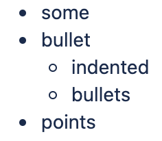
Use the asterisk (*) to create bullets. For each subsequent level, add an extra asterisk.
Make sure there is a space between the asterisk and your text.
What you need to type | What you'll get |
|---|---|
|
|
Numbered lists
Use the hash (#) to create numbered lists.
Make sure there is a space between the hash and your text.
What you need to type | What you'll get |
|---|---|
|
|
A second level of hashes will produce a sub-list, such as the alphabetical sub-list shown below.
What you need to type | What you'll get |
|---|---|
|
|
You can use a third level of hashes to produce a sub-sub-list.
What you need to type | What you'll get |
|---|---|
|
|
Note: In numbered lists as described above, the format of the 'number' displayed at each list level may be different, depending upon your browser and the style sheets installed on your Confluence instance. So in some cases, you may see letters (A, B, C, etc; or a, b, c, etc) or Roman numerals (i, ii, iii, etc) at different list levels.
Mixed lists
What you need to type | What you'll get |
|---|---|
|
|
Tables
You can create two types of tables.
Table Type 1
Allows you to create a simple table with an optional header row. Once you've added this type of table, you can set the width of the columns using the table controls in the toolbar.
Use double bars for a table heading row.
What you need to type:
|
What you'll get:
heading 1 | heading 2 | heading 3 |
|---|---|---|
cell A1 | cell A2 | cell A3 |
cell B1 | cell B2 | cell B3 |
You can also use a vertical header.
What you need to type:
||heading 1|col A1|col A2|col A3|
||heading 2|col B1|col B2|col B3|
What you'll get:
heading 1 | col A1 | col A2 | col A3 |
|---|---|---|---|
heading 2 | col B1 | col B2 | col B3 |
Table Type 2
This method uses section and column macros to create the table, and allows you to specify the width of the columns in the markup.
What you need to type
{section:border=true}
{column:width=30%}
Text for this column goes here. This is  the smaller column with a width of only 30%.
{column}
{column:width=70%}
Text for this column goes here. This is  the larger column with a width of 70%.
{column}
{section}
What you'll get
Text for this column goes here. This is the smaller column with a width of only 30%.
Text for this column goes here. This is the larger column with a width of 70%.
For more details please see the Column Macro and the Section Macro.
Advanced Formatting
Color and Other Formatting
To add color and other formatting to your tables, you can use the Panel Macro within columns.
More table-formatting options may be available if your Confluence administrator has installed additional macros.
Lists
Here's an example of how to embed lists in a table:
What you need to type
||Heading 1||Heading 2||
|* Item 1
* Item 2
* Item 3|# Item 1
# Item 2
# Item 3|
What you'll get
Heading 1 | Heading 2 |
|---|---|
|
|
Text Effects
Use the markup shown in the examples below to format text.
What you need to type | What you'll get |
|---|---|
*strong* | strong |
*bold text* | bold text |
_emphasis_ | emphasis |
_italics_ | italics gives you this: Thingx |
| ??citation?? | citation |
-deleted- | deleted |
+inserted+ | inserted |
Text with^superscript^ | Text withsuperscript Hint: There are two ways to make superscripts work, when used directly after another word or character:
gives you this: kg/m3 |
Text with~subscript~ | Text withsubscript |
|
|
|
|
{color:red}look ma, red text!{color} | look ma, red text! |
Text Breaks
Paragraph Break
In wiki markup, a paragraph is a continuous line of text ending in two carriage returns. This is equivalent to a continuous line of text followed by a blank line.
When rendered into HTML, the result is a line of text wrapped in a set of <p></p> tags.
Line Break
Confluence provides two options for forcing a line break within a paragraph of text:
- Implicitly, by entering a single carriage return at its end.
- Explicitly, by entering two consecutive backslashes: \\
When rendered into HTML, the result is a paragraph of text that is split into separate lines by <br> tags, wherever a forced line break appears.
For most purposes, explicit line breaks are not required because a single carriage return is enough.
The examples below show how to use explicit line breaks.
What you need to type | What you'll get |
|---|---|
here is some text \\ divided \\ using line \\ \\ breaks\\ | here is some text |
This is a short list: \\ \\ Text to go with point 2 with a break | This is a short list:
|
If you wish to use multiple consecutive line breaks, each should be separated by a space character. For example, use this for two consecutive line breaks:
\\ \\Horizontal Rule
To create a horizontal line across the width of your page or content block, type four dashes (like this: ----) at the beginning of a line, then press Enter or space.
Make sure that the dashes are on a separate line from the rest of the text.
What you need to type | What you'll get |
|---|---|
here is some text divided by a horizontal rule | here is some text divided by a horizontal rule |
Links
You can use wiki markup to add hyperlinks to your text.
What you need to type | What you'll get |
|---|---|
[#anchor] | A link to an anchor on the same page. |
[Confluence Wiki Markup^attachment.ext] | A link to a file attached to the page. |
[pagetitle] | A link to a page. |
[pagetitle#anchor] | A link to an anchor on another page. |
[pagetitle^attachment.ext] | A link to a file attached to another page. |
[spacekey:pagetitle] | A link to a page in another space. |
[spacekey:pagetitle#anchor] | A link to an anchor on a page in another space. |
[spacekey:pagetitle^attachment.ext] | A link to a file attached to a page in another space. |
[/2004/01/12/blogposttitle] | A link to a blog post. |
[spacekey:/2004/01/12/blogposttitle] | A link to a blog post in another space. |
[/2004/01/12] | A link to a whole day's blog posts. |
[spacekey:/2004/01/12] | A link to a whole day's blog posts in another space. |
[spacekey:] | A link to the space homepage (or the space summary page of the space. |
[~username] | A link to the user profile page of a particular user. |
[phrase@shortcut] | A shortcut link to the specified shortcut site. Shortcuts are configured by the site administrator. |
[http://confluence.atlassian.com] | A link to an external resource. |
[mailto:legendaryservice@atlassian.com] | A link to an email address. |
[file://z:/file/on/network/share.txt] | A link to a file on your computer or on a network share that you have mapped to a drive. This only works on Internet Explorer. |
| [!http://external/image.png!|http://external/link.html] | Displays an external image and links to an external URL. |
Note that Confluence treats headings as anchors, so you can link to headings using this pattern: [spacekey:pagename#headingname], where headingname is case-sensitive and must be entered without spaces.
For each of these link forms:
- You can prepend a link alias, so that alternate text is displayed on the page. Example: [link alias|pagetitle#anchor]
- You can append a link tip, which appears as a tooltip. Example: [pagetitle#anchor|link tip]
Images
You can display images from attached files or remote sources.
What you need to type | What you'll get |
|---|---|
!http://www.host.com/image.gif! | An image from a remote source is displayed on the page. Uses a fully qualified URL. |
!attached-image.gif! | An image file attached to the page is displayed. |
!pageTitle^image.gif! | An image file attached to a different page is displayed. |
!spaceKey:pageTitle^image.gif! | An image file attached to a page in a different space is displayed. |
!/2010/05/23/My Blog Post^image.gif! | An image file attached to a blog post is displayed. |
!image.jpg|thumbnail! | The image is displayed as a thumbnail on the page (only works with images that are attached to the page). Users can click on the thumbnail to see the full-sized image. Thumbnails must be enabled by the site administrator for this to work. |
!image.gif|align=right, vspace=4! | For any image, you can specify attributes of the HTML image tag as a comma separated list of name=value pairs. |
Available HTML image tags include:
Image tag | Details |
|---|---|
align | Available values are 'left', 'right', 'bottom', 'center', 'top'. |
border | Specifies the width of the border (in pixels). |
bordercolor | Use with the 'border' tag. Specify colors by name or hex value. |
hspace | Specifies the amount of whitespace to be inserted to the left and right of the image (in pixels). |
vspace | Specifies the amount of whitespace to be inserted above and below the image (in pixels). |
width | Specifies the width of the image (in pixels). This will override the natural width of the image. |
height | Specifies the height of the image (in pixels). This will override the natural height of the image. |
title | Specifies alternate text for the image, which is displayed when the pointer hovers over the image. |
alt | Specifies alternate text for the image. This text is retrievable via search, and contributes to accessibility of the page for text-only viewing. |
Page Layouts
There is no wiki markup representation for page layouts.
Macros
Storage format and wiki markup examples have been included in the documentation for each macro.