Community resources
Community resources
- Community
- Products
- Jira Software
- Advanced planning
- Articles
- Ending support for the Advanced Roadmaps Live plans (Legacy interface) in Jira Data Center 9.0
Ending support for the Advanced Roadmaps Live plans (Legacy interface) in Jira Data Center 9.0
|
Support for Live Plans in Advanced Roadmaps will be removed from Data Center 9.0, which is expected to be released between May and June of 2022. The Improved experience for Advanced Roadmaps will continue to be available. This is an update to the same change we announced in January 2021 and have since made in Cloud in July of 2021. |
With the launch of Jira Data Center 9.0, users will only be able to use the recently introduced Improved interface in Advanced Roadmaps. While this may be a shock to some of our customers, we think this is going to be a big step forward for the company and we’re excited about what this means for the future of Advanced Roadmaps.
Understandably, we still have customers who use (and are dearly attached to) Live plans. But worry not: the Improved interface has progressed leaps and bounds from its infancy to the point that we feel it’s ready to be the main face of Advanced Roadmaps. Over the course of this article, we’re going to walk though the biggest improvements, complete with links to documentation.
Before we get too far into the weeds, Advanced Roadmaps is still a sandbox environment. As you explore, none of the changes you make in your timeline will be committed to your plan until you select the blue button labeled “Review changes”. If you don’t want to apply the changes, discard them and it’s like they never happened.
So feel free to tinker, fiddle, and wonder “what happens if I do this…”
A hybrid approach to planning
A common note that we received was that the Legacy interface worked really well with data that was complete and well-maintained. But when things didn't go according to plan, that rigid, data-planning approach became a liability. You told us about your creative solutions and workarounds that were cumbersome at best, and confusing at worst.
To address this, we’ve instituted a series of fundamental changes that make the Improved interface easier to use on a daily basis.
Drag and drop functionality
In the Improved interface, you can schedule issues directly on the timeline, adjust automatically-scheduled issues, change start and end dates, and even re-order issues with a simple drag and drop. And once you’ve made that change, Advanced Roadmaps will show you how it affects the rest of your plan in real time.
New auto-scheduling (link to doc)
The new Auto-scheduling tool in the Improved interface replaces the Calculate function in the Legacy interface, combining intelligent automation tools with easy to use functionality. Use the auto-scheduler when working with large data sets to organize your issues based on dates, rankings, dependencies, and more. The auto-scheduler can even extrapolate incomplete data – a real hum-dinger when working with big plans that don’t always have super-clean data. After you schedule your plan, you can use the previously-mentioned drag and drop functionality to quickly make manual adjustments.
Roll-up values (link to doc)
Another automated planning tool in the Improved interface is the ability to roll-up values to their parent issues. This new feature helps fill in gaps quickly and easily if you’re working with incomplete data. When turned on, Advanced Roadmaps will automatically fill in start and end values for parent issues based off of its child issues' values. For example, the Improved interface can auto-fill the due dates of an Epic level issue using the dates of the story-level issues that live inside of it.
It can also automatically adjust the dates of issues if you miss a deadline (which happens; no judgement) so your timeline will remain accurate without having to manually correct every single issue.
Bulk actions (link to doc)
In the Improved interface, you can now select multiple issues and apply the chosen action to all of them. This makes handling bulk tasks and wholesale changes easier. Aside from assigning issues to a new team, you can also re-rank issues and assign multiple issues to a parent task in a matter of seconds.
Team capacity management
As more organizations plan at the team-level instead of individual, we’ve responded by changing how the Improved interface tracks capacity. The new team capacity management tool (link to doc) focuses on how much your team can accomplish during a sprint and less on individual contributors. While this approach doesn’t offer the granular control found in Live plans, it compensates by being much simpler to use.
In the Improved interface, team sprint capacity is now part of your timeline. You can view teams' capacity in current and future sprints, and make adjustments which will appear in your plan in real-time. And you can adjust the capacity of a sprint in a matter of seconds without navigating away from your timeline.
However, some team management aspects of the legacy interface have gone the way of the dodo. In the improved interface, you won’t find working hours and days, skills/stages, individual absences, and virtual team members.
Your data in context
Another big change is how the Improved interface handles reporting. It still provides the same information as Reports in the Legacy interface, just in a different manner. The Improved interface doesn’t make “reports” in the way that the legacy interface did. Instead, it lets you filter the data on your timeline to show a specific aspect of your plan. This less-siloed way of viewing your plan lets you mix-and-match your data to tell the unique story of your project.
The Improved interface comes with four built-in Preset views (link to doc) which are designed for different roles which you can then modify to Create your own saved view (link to doc) by filtering issues (link to doc). When combined with the Export to .csv (link to doc) function, you can create custom reports to share with stakeholders in much the same way you did with the Legacy Interface.
“But I liked my old reports,” you say. “How do I make it do exactly what it did before?” Well, we’ve got you covered. Below are some ways you can see the same information in the Improved Interface.
Managing sprints and capacity
Watch a video of our PM explaining dependencies in the new Improved interface.
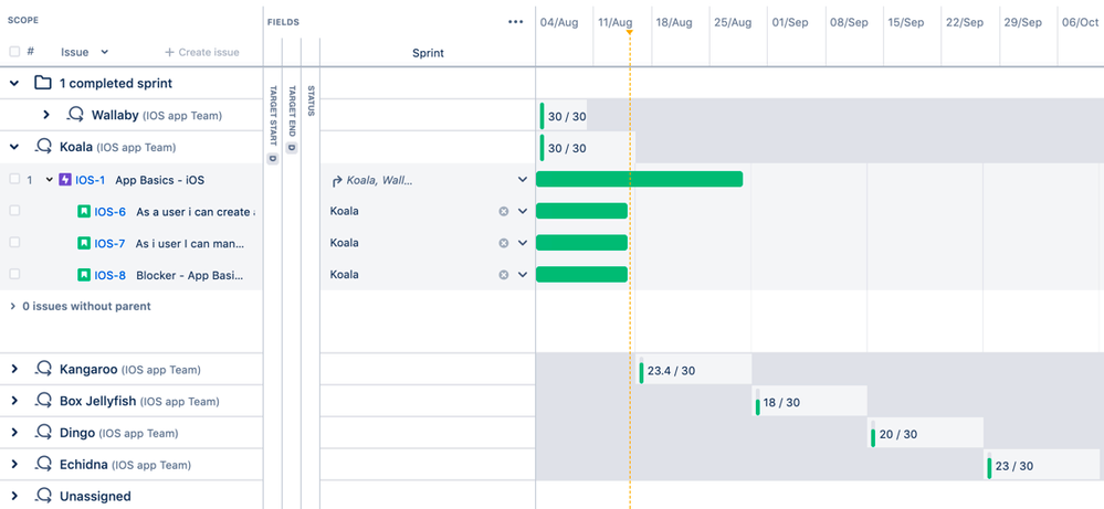
In the Improved interface, managing sprints and a team’s sprint capacity no longer requires leaving your timeline. For instance, if you select Group by sprint (link to doc) in the View settings menu, Advanced Roadmaps will organize your issues order sprints by start date and group them based on the team to which they’re assigned, as seen below:
Once grouped, you can also choose to include capacity in your plan. By viewing it directly on your timeline, you can rebalance sprint capacity in real time by reassigning issues to different sprints or teams.
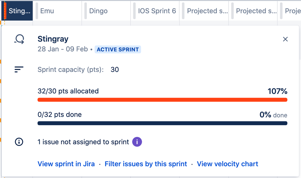
The sprint capacity window, pictured below, is another new feature of the Improved interface which you can use to get a quick glimpse into the health of your sprints. From this window, you can also change the capacity of your sprints to reflect absences on your team or public holidays.
When a sprint is overloaded, it turns red like in the example below. In this window, both the vertical bar in the sprint tab (in this case, “Stingray”) as well as the sprint allocation bar indicate this sprint overbooked.
These are just a few ways that you can manipulate your data to get better insights into your plan. We’ll cover more ways in the documentation, but the takeaway from this is that there isn’t one right or wrong way to view your data.
Dependencies reports
The first (and recommended) way to manage dependencies in the Improved interface is using the Dependency management preset view (link to doc), as shown below:
-
Dependencies (incoming and outgoing), priority, target start date, target end date, and team columns
-
One year timeframe
-
Hierarchy set from epic level to sub-task level
-
Filtered by issues with dependencies
-
Issues colored by status
-
Issues sorted by ranking
You can also add the dependency column to any custom plan (link to doc).
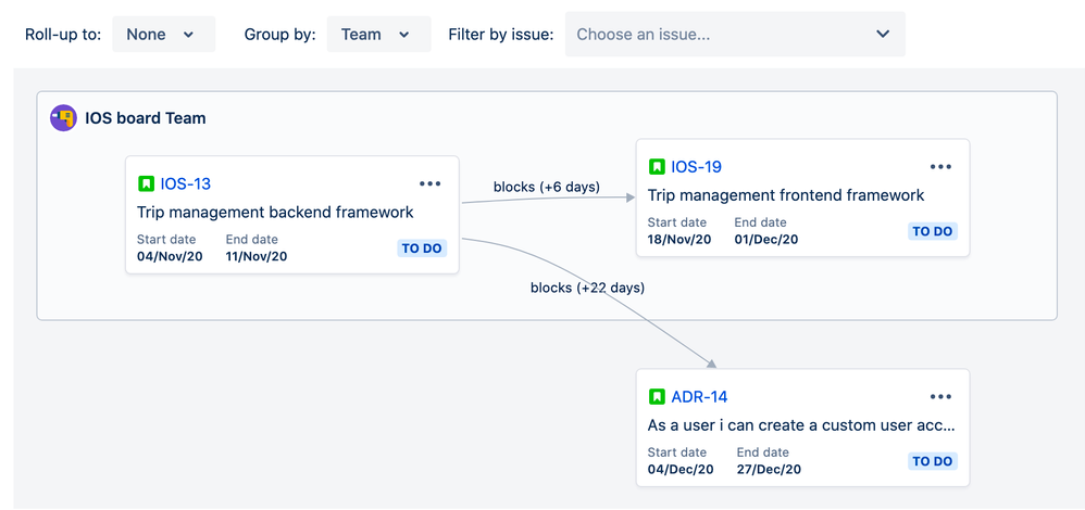
If you’re more of a visual planner, Advanced Roadmaps includes a tool called the Dependencies map (link to doc) that shows how issues are connected, even across sprints and projects.
Unlike other views discussed so far, you can’t make any changes while looking at the Dependencies map. Right now, this is just a way to better visualize the layout of your plan.
Schedule reports
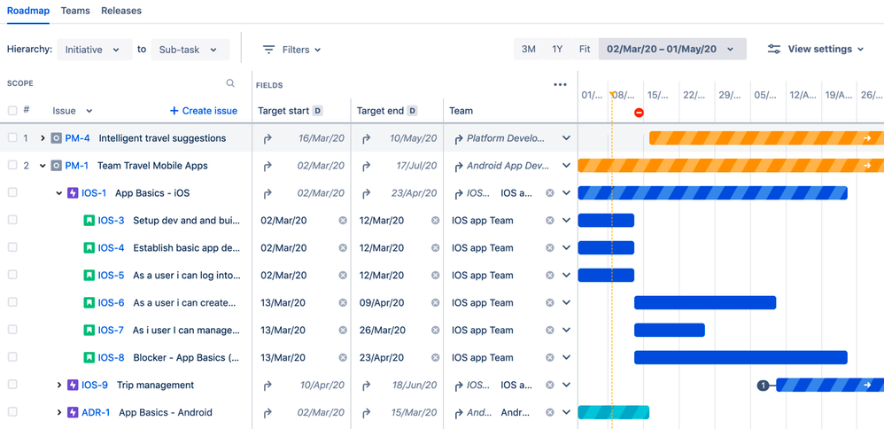
In the Improved interface, all of the information found in the Schedule reports from Live plans now lives in the Roadmap tab underneath the name of your plan:
Themes report
As it stands right now, there isn’t an apples-to-apples replacement for the Themes report in the Improved interface. To put it simply, the Themes field from the Legacy interface was only used in Advanced Roadmaps, and the Improved interface is designed to integrate with other Atlassian products using global data. That said, you can still get most of the same functionality in the Improved interface.
The Custom fields feature (link to doc) allows you to set single-choice select, multiple-choice select, and custom labels. You can then color by those fields, and categorize by those colors. This will allow you to essentially create your own “themes” and then show only issues with that label. The one main difference with this method is that the report generated will show the number of issues to which that label applies, but the report not take the weight of each issue into account.
You can also use any of the advanced reports available in Jira Software (which you can read more about in the Jira software docs here and here).
Other reports
-
Release reports have been replaced by Group by releases (link to doc)
-
Team Member reports have been replaced by the following:
-
Group by assignees and projects (‘team members’ field is now the assignee field) (link to doc)
-
Group by teams (link to doc)
-
Group by components (link to doc)
-
Group by labels (link to doc)
-
For the smoothest transition
Overall, the Improved interface gives a clearer, simpler picture of your planning estimates. When you switch from the Legacy interface, none of your calculations will change but they may look slightly different. This is because, in order to make it more flexible and intuitive, the Improved interface uses a less granular method of estimating tasks.
If some teams want to keep the granular estimates from their Legacy plans for reference, we recommend exporting a .csv of your plans before switching. We also recommend that you commit any unsaved changes to your Jira instance.
Make the jump!
Like what you see? Let’s get you changed over to the new interface. When you are ready, just head into your plan’s settings (accessed via the “…” next to your plan’s name) and Enable the Improved interface (link to doc). We’re pretty sure you’re gonna love it.
Was this helpful?
Thanks!
Rhys Christian

About this author
Product Manager | Advanced Roadmaps
Atlassian
Sydney (AU)
13 accepted answers
Atlassian Community Events
- FAQ
- Community Guidelines
- About
- Privacy policy
- Notice at Collection
- Terms of use
- © 2024 Atlassian


3 comments