Sort days of the week in heat map charts
Platform Notice: Cloud Only - This article only applies to Atlassian products on the cloud platform.
Summary
A heat map is a two-dimensional representation of data in which values are represented by colors. A simple heat map provides an immediate visual summary of information. More elaborate heat maps allow the viewer to understand complex datasets. There can be many ways to display heat maps, but they all share one thing in common—they use color to communicate relationships between data values that would be much harder to understand if presented numerically in a spreadsheet.
Solution
Custom sorting for heat map columns
When displaying data across two categories in the form of a heat map matrix, you may want to display the data by time—for example, by “hour of day” with “day of week”, or by “hour of day” with “day of month.”
In these cases, you generally want your heat map’s y-axis to be sorted by day or time; however, you may find that your axis showing “day of week” is not ordered properly.
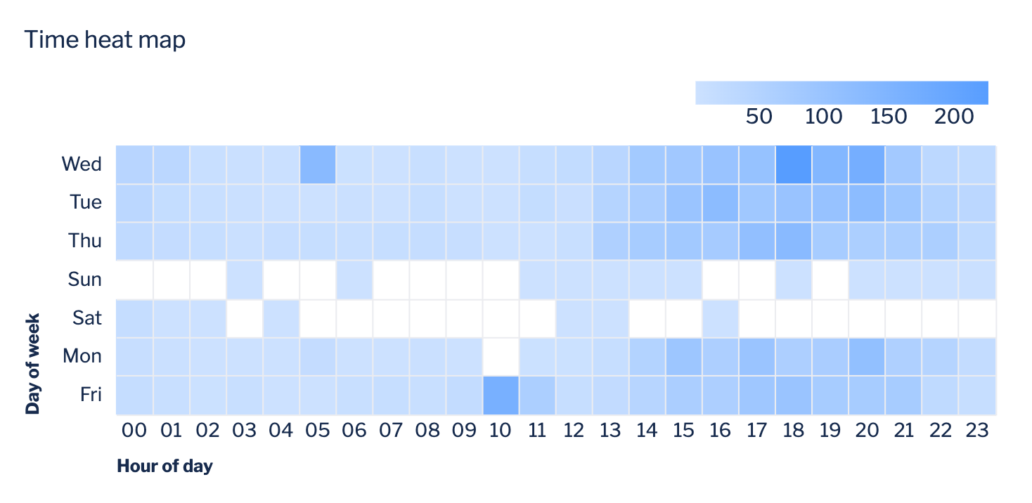
The potential quick fix is to open the chart settings, go to the Axis tab, then change the Sort of the y-axis to Unsorted. If this doesn’t solve the issue, keep reading for instructions on how to get your heat map sorted.
You’ll need to create an intermediate step that allows you to sort in your desired order. This involves adding a CASE statement to apply a number to each day of the week then sorting the assigned numbers.
To sort your y-axis labels:
Add a “Formula column” step, select Custom as the formula type, then use the following
CASEstatement as the formula, replacing “Day of Week: Created At” with the name of your “day of week” column:1 2 3 4 5 6 7 8 9 10CASE WHEN "Day of Week: Created At"='Sun' THEN 1 WHEN "Day of Week: Created At"='Mon' THEN 2 WHEN "Day of Week: Created At"='Tue' THEN 3 WHEN "Day of Week: Created At"='Wed' THEN 4 WHEN "Day of Week: Created At"='Thu' THEN 5 WHEN "Day of Week: Created At"='Fri' THEN 6 WHEN "Day of Week: Created At"='Sat' THEN 7 ELSE 0 END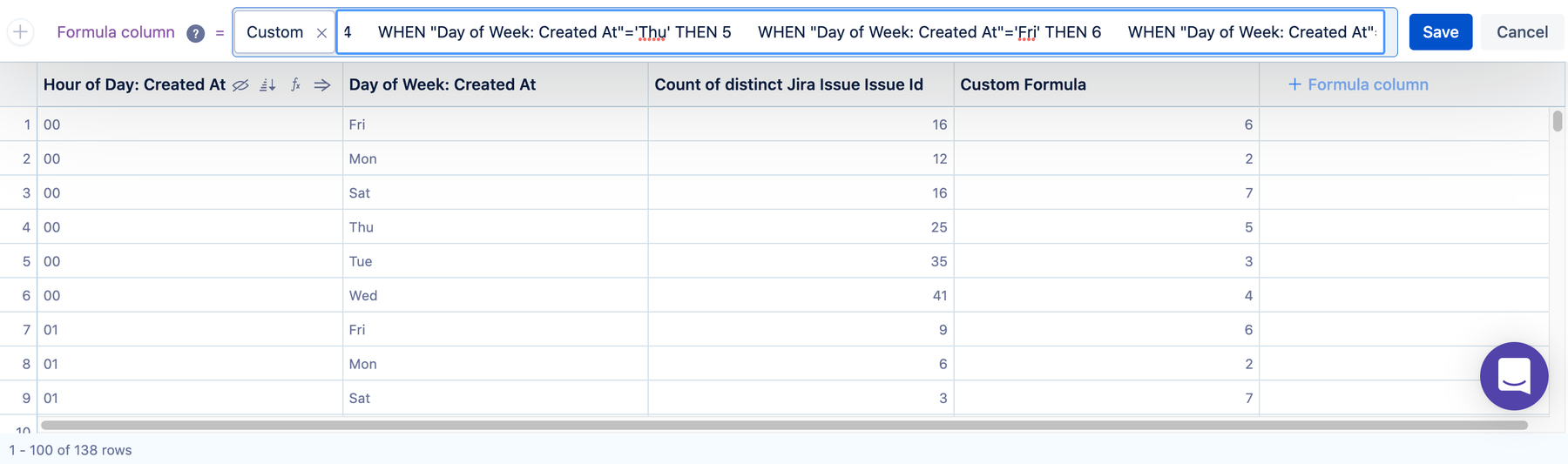
Use a “Sort rows” step to sort the new column in ascending order.
Hide the “Custom Formula” column—it is no longer needed.
Your heat map should now be sorted in your desired order. This doesn’t just work for heat maps; it also works for other chart types where you’d like to apply a custom sort order.
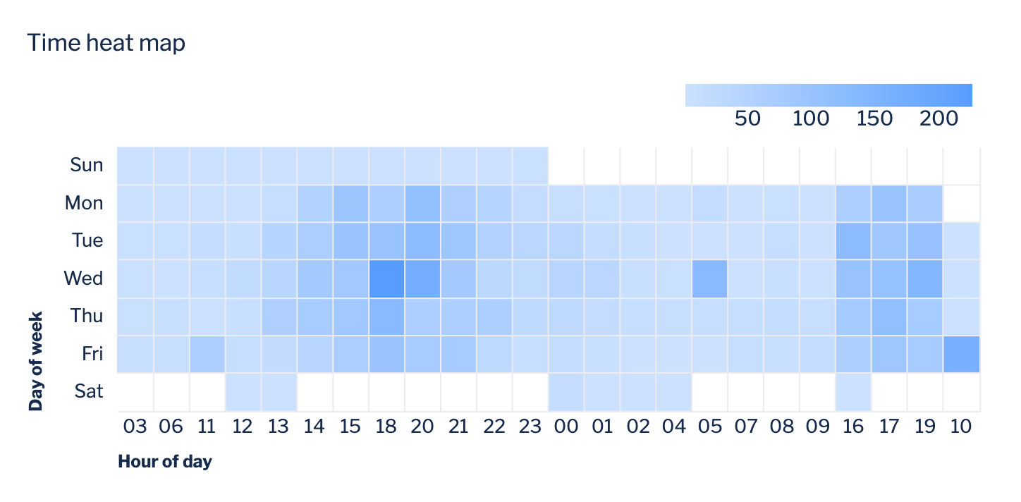
You may still need to go to the chart settings and change the sort setting of the y-axis as described in the quick fix mentioned earlier.
Was this helpful?