Chart Macro
This macro is available in Confluence Data Center and Confluence Cloud. Learn about the macros available in Confluence Cloud.
Add the Chart macro to a page to display a chart based on data in a table on the same page, or from an attached file.
This is great for showing a simple visualisation of data on the page.
On this page:
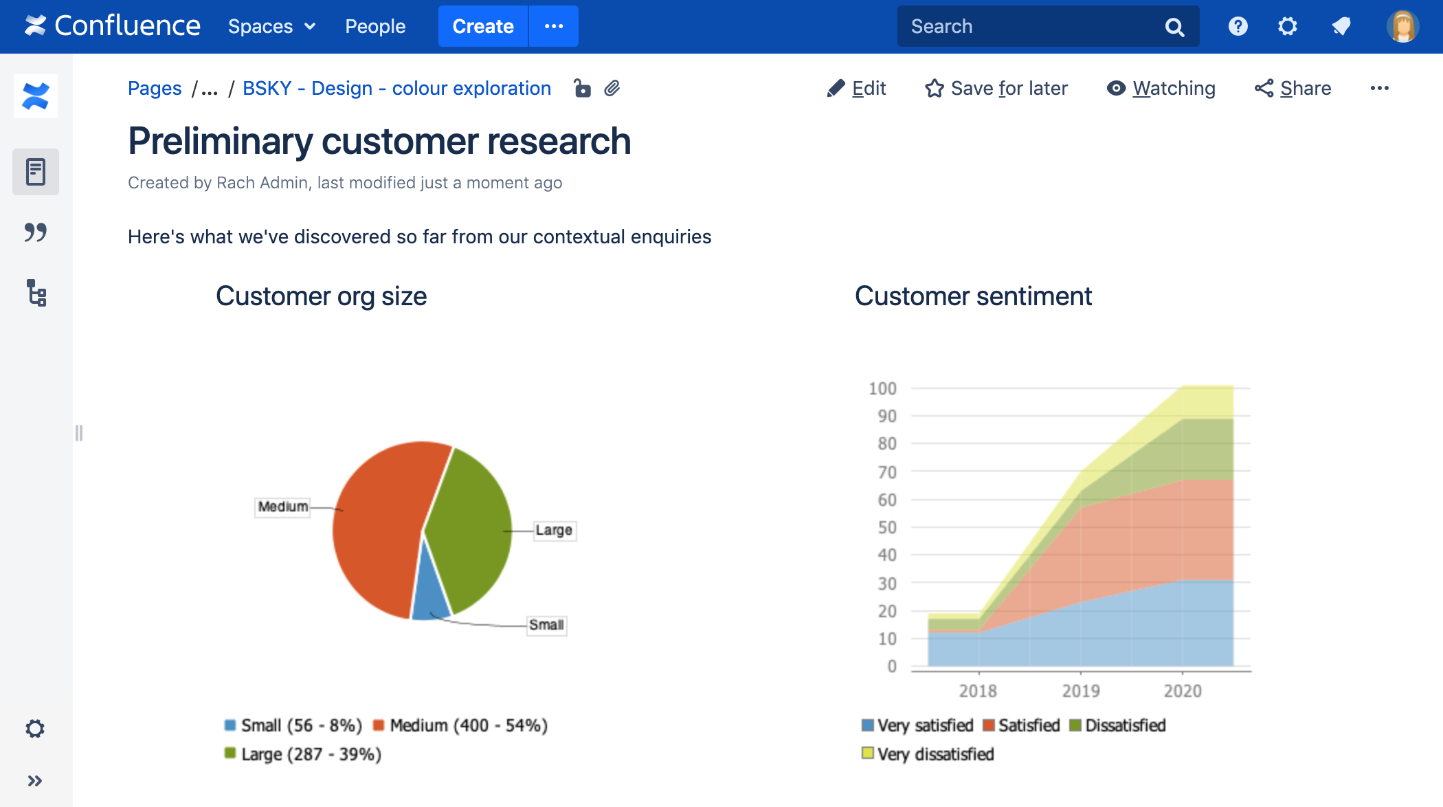
Screenshot: Page with two chart macros.
Want to display information from Jira on your page? Check out the Jira Chart Macro.
Add the Chart macro to your page
To add the Chart macro to a page:
- From the editor toolbar, select Insert
 , then Other Macros.
 - Choose Chart from the Visuals and images category.
- Choose Insert.
- Enter your chart data as one or more tables in the body of the macro placeholder. See the examples later in this page for more info.
- Click the macro placeholder and choose Edit.
- Select a chart type using the Type parameter (see below).
- Choose other parameter settings in the macro browser, as described below.
- Click Refresh in the 'Preview' area, to check that the chart appears as you expect.
- Click Save to add the chart to your page.
You can then publish your page to see the macro in action.
Screenshot: Two Chart macros in the editor, containing the data for a pie chart and stacked chart.

Change the macro parameters
Macro parameters are used to change the behavior of a macro.
To change the macro parameters:
- In the editor, click the macro placeholder and select Edit.

- Update the parameters as required then select Insert.
Here's a list of the parameters available in this macro.
Chart Type Parameters
These parameters determine the type of chart to display and the way the chart looks.
| Parameter | Default | Description |
|---|---|---|
| Type | pie | The type of chart to display. XY charts have numerical x- and y-axes. The x values may optionally be time-based (see the Time Series parameter). Standard — pie, bar, line, area XY Plots — xyArea, xyBar, xyLine, xyStep, xyStepArea, scatter, timeSeries Other — gantt |
| Display Orientation | vertical | Applies to area, bar and line charts.
|
| Show in 3D | false | Applies to area, bar and line charts. |
| Stacked Values | false | Applies to area and bar charts. |
| Show shapes | true | Applies to line charts. Shapes are shown at each data point. |
| Opacity |
| A percentage value between 0 (transparent) and 100 (opaque) that determines how opaque the foreground areas and bars are. |
Display Control Parameters
| Parameter | Default | Description |
|---|---|---|
| Width | 300 | The width of the chart in pixels. The maximum width is limited by the confluence.chart.macro.width.max system property. |
| Height | 300 | The height of the chart in pixels. The maximum height is limited by the confluence.chart.macro.height.max system property. |
| Display rendered data | false | Sets whether to display the rendered body of the macro (usually the data tables). By default, the chart data table isn't rendered.
|
| Image format | png | The image format to be used for the chart.
|
Title and Label Parameters
| Parameter | Default | Description |
|---|---|---|
| Chart Title | none | The title of the chart. |
| Chart Subtitle | none | A subtitle for the chart, using a smaller font than for Title. |
| Horizontal-axis Label | none | The label for the x-axis (domain). |
| Vertical-axis Label | none | The label for the y-axis (range). |
| Show Legend | true | Show a legend or key. |
Data Specification Parameters
The data for the chart is taken from tables found when the macro body is rendered. These options control how this data is interpreted. By default, numeric and date values are interpreted according to the Confluence global default language (locale) formats. If conversion fails, other languages defined in Confluence will be tried. Additional conversion options can be specified using the parameters below.
| Parameter | Default | Description |
|---|---|---|
| Tables | all first level tables | Comma separated list of table ids and/or table numbers (starting at 1) contained within the body of the macro that will be used as the data for the chart. If data tables are embedded in other tables, then table selection will be required. This occurs when more complex formatting is done (for example using section and column macros). |
| Columns | all columns | Comma separated list of column labels and/or column titles and/or column numbers for tables used for chart data. This applies to all tables processed. Columns are enumerated starting at 1. Column label is the text for the column in the header row. Column title is the (html) title attribute for the column in the header row. |
| Content Orientation | horizontal |
|
| Time Series | false |
|
| Date format | Confluence language defined date formats | For time series data, the date format allows for additional customization of the conversion of data to date values. If a Date format is specified, it will be the first format used to interpret date values. Specify a format that matches the time series data. See simple date format. |
| Time Period | Day | The time period for time series data. Defines the granularity of how the data is interpreted. Valid values are: Millisecond, Second, Minute, Hour, Day, Week, Month, Quarter, Year. |
| Language | none | Use in combination with the Country parameter to form a locale. These additional number and date formats will be used for data conversion before the default languages. Valid values are 2 character ISO 639-1 alpha-2 codes. |
| Country | none | Use in combination with the Language parameter to form a locale. Valid values are 2 character ISO 3166 codes. |
| Forgive | true |
|
Color Parameters
Colors are specified using hexadecimal notation or HTML color names.
| Parameter | Default | Description |
|---|---|---|
| Background Color | White | Background of the chart. |
| Border Color | no border | Border around the chart. |
| Colors | Comma-separated list of colors used to customize category, sections, and series colors. |
Axis Parameters
Depending on the chart type, the range and domain axis may be customized. These values are automatically generated based on the data but can be overridden by specifying one or more more of these parameters.
| Parameter | Default | Description |
|---|---|---|
| Range Minimum Value | none | Range axis lower bound. |
| Range Maximum Value | none | Range axis upper bound. |
| Range Axis Tick Unit | none | Range axis units between axis tick marks. |
| Range Axis Label Angle | none | Angle for the range axis label in degrees. |
| Domain Axis Lower Bound | none | Only applies to XY plots. Domain axis lower bound. For a date axis, this value must be expressed in the date format specified by the Date format parameter. |
| Domain Axis Upper Bound | none | Only applies to XY plots. Domain axis upper bound. For a date axis, this value must be expressed in the date format specified by the Date format parameter. |
| Domain Axis Tick Unit | none | Only applies to XY plots. Domain axis units between axis tick marks. For a date axis, this value represents a count of the units specified in the Time Period parameter. The Time Period unit can be overridden by specifying a trailing character: y (years), M (months), d (days), h (hours), m (minutes), s (seconds), u (milliseconds). |
| Domain Axis Label Angle | none | Only applies to XY plots. The angle for the domain axis label, in degrees. |
| Category Label Position | none | Placement of the axis label text for categories.
|
| Date Tick Mark Position | start | Placement of the date tick mark.
|
Pie Chart Parameters
| Parameter | Default | Description |
|---|---|---|
| Pie Section Label | Show only the pie section key value | Format for how pie section labels are displayed. The format uses a string with special replacement variables:
Example 1: "%0% = %1%" would display something like "Independent = 20" |
| Pie Section Explode | No exploded sections | Comma separated list of pie keys that are to be shown exploded. Note: requires jFreeChart version 1.0.3 or higher. |
Attachment Parameters
These are advanced options that can be used for chart versioning, to enable automation and to improve performance. Use these options carefully! Normally, the chart image is regenerated each time the page is displayed. These options allow for the generated image to be saved as an attachment and have subsequent access re-use the attachment. This can be useful especially when combined with the Cache Pluginto improve performance. Depending on the options chosen, chart images can be versioned for historical purposes.
| Parameter | Default | Description |
|---|---|---|
| Attachment | none | The name and location with which the chart image will be saved as an attachment. The user must be authorized to add attachments to the page specified.
|
| Attachment Version | new | Defines the the versioning mechanism for saved charts.
|
| Attachment Comment | none | Comment used for a saved chart attachment. |
| Thumbnail | false |
|
Pie chart
Here's an example of a pie chart.

To create this chart, we set these parameters in the macro browser:
- Type: pie
- Chart title: Fish sold in 2011
- Show legend: true
- Content orientation: vertical
and added this table in the macro body:
Fish Type | 2011 |
|---|---|
Herring | 9,500 |
Salmon | 2,900 |
Tuna | 1,500 |
Bar chart
Here's an example of a bar chart.

To create this chart, we set these parameters in the macro browser:
- Type: bar
- Chart title: Fish sold
- Show legend: True
and added this table in the macro body:
Fish Type | 2010 | 2011 |
|---|---|---|
Herring | 9,500 | 8,300 |
Salmon | 2,900 | 4,200 |
Tuna | 1,500 | 1,500 |
3D Bar chart
Here's an example of a 3D bar chart.

To create this chart, we set these parameters in the macro browser:
- Type: bar
- Show in 3D: true
- Opacity: 50
- Show legend: true
and added this table in the macro body:
2009 | 2010 | 2011 |
|---|---|---|
Revenue | 12.4 | 31.8 |
Expense | 43.6 | 41.8 |
Time series chart
Here's an example of a Time series chart.

To create this chart, we set these parameters in the macro browser:
- Type: Time series
- Date format: MM/yyyy
- Time period: Month
- Content orientation: vertical
- Range axis lower bound: 0
- Show legend: true
and added these two tables in the macro body:
Month | Revenue |
|---|---|
1/2011 | 31.8 |
2/2011 | 41.8 |
3/2011 | 51.3 |
4/2011 | 33.8 |
5/2011 | 27.6 |
6/2011 | 49.8 |
7/2011 | 51.8 |
8/2011 | 77.3 |
9/2011 | 73.8 |
10/2011 | 97.6 |
11/2011 | 101.2 |
12/2011 | 113.7 |
Month | Expenses |
|---|---|
1/2011 | 41.1 |
2/2011 | 43.8 |
3/2011 | 45.3 |
4/2011 | 45.0 |
5/2011 | 44.6 |
6/2011 | 43.8 |
7/2011 | 51.8 |
8/2011 | 52.3 |
9/2011 | 53.8 |
10/2011 | 55.6 |
11/2011 | 61.2 |
12/2011 | 63.7 |
XY Line Chart
Here's an example of a XY Line chart.

To create this chart, we set these parameters in the macro browser:
- Type: xyLine
- Show legend: true
and added this table in the macro body:
12 | 14 | 23 | |
|---|---|---|---|
Revenue | 41.1 | 31.8 | 12.4 |
Expense | 31.1 | 41.8 | 43.6 |
XY Area Chart
Here's an example of an XY Area chart.

To create this chart, we set these parameters in the macro browser:
- Type: xyArea
- Show legend: true
and added this table in the macro body:
12 | 14 | 23 | |
|---|---|---|---|
Revenue | 41.1 | 31.8 | 12.4 |
Expense | 31.1 | 41.8 | 43.6 |
Area chart
Here's an example of an area chart.

To create this chart, we set these parameters in the macro browser:
- Type: area
- Show legend: true
- Width: 300
- Height: 300
- Opacity: 50
and added this table in the macro body:
Satisfaction | 2009 | 2010 | 2011 |
|---|---|---|---|
Very satisfied | 20 | 23 | 34 |
Satisfied | 40 | 34 | 23 |
Dissatisfied | 25 | 26 | 25 |
Very dissatisfied | 15 | 17 | 18 |
Stacked area chart
Here's another example of an Area chart.

To create this chart, we set these parameters in the macro browser:
- Type: area
- Show legend: true
- Width: 300
- Height: 300
- Stacked values: true
and added this table in the macro body:
Satisfaction | 2009 | 2010 | 2011 |
|---|---|---|---|
Very satisfied | 12 | 23 | 31 |
Satisfied | 1 | 34 | 36 |
Dissatisfied | 4 | 6 | 22 |
Very dissatisfied | 2 | 7 | 12 |
Gantt chart
Here's an example of a Gantt chart.

To create this chart, we set these parameters in the macro browser:
- Type: gantt
- Width: 300
- Height: 200
- Columns: ,,1,2,3,4 (note the two commas to start)
- Date format: MM/dd/yyyy
and added these two tables in the macro body:
| Plan | Start | End | Status |
|---|---|---|---|
| Stage 1 | 6/25/2013 | 7/10/2013 | 30% |
| Stage 2 | 7/13/2013 | 11/28/2013 | 40% |
| Stage 3 | 12/1/2013 | 12/25/2013 |
| Actual | Start | End | Status |
|---|---|---|---|
| Stage 1 | 6/25/2013 | 7/26/2013 | 100% |
| Stage 2 | 7/29/2013 | 12/01/2013 | 40% |
| Stage 3 | 12/10/2013 | 12/25/2013 |
![]() You must include the two leading commas in the column parameter (for example
You must include the two leading commas in the column parameter (for example ,,1,2,3,4) for the chart to be created correctly.
Other ways to add this macro
Add this macro as you type
Add this macro using wiki markup
This is useful when you want to add a macro outside the editor, for example as custom content in the sidebar, header or footer of a space.
Macro name: chart
Macro body: Accepts rich text, consisting of tables that hold the chart's data.
Below is a simple example of a pie chart. See more examples in Wiki Markup Examples for Chart Macro.
{chart:type=pie|title=Fish Sold}
|| Fish Type || 2004 || 2005 ||
|| Herring | 9,500 | 8,300 |
|| Salmon | 2,900 | 4,200 |
|| Tuna | 1,500 | 1,500 |
{chart}
This macro recognizes a large number of parameters, listed here by type.
Do more with Confluence
Create interesting and engaging charts for your Confluence pages with these top charts and diagrams apps on the Atlassian Marketplace.