Look and feel
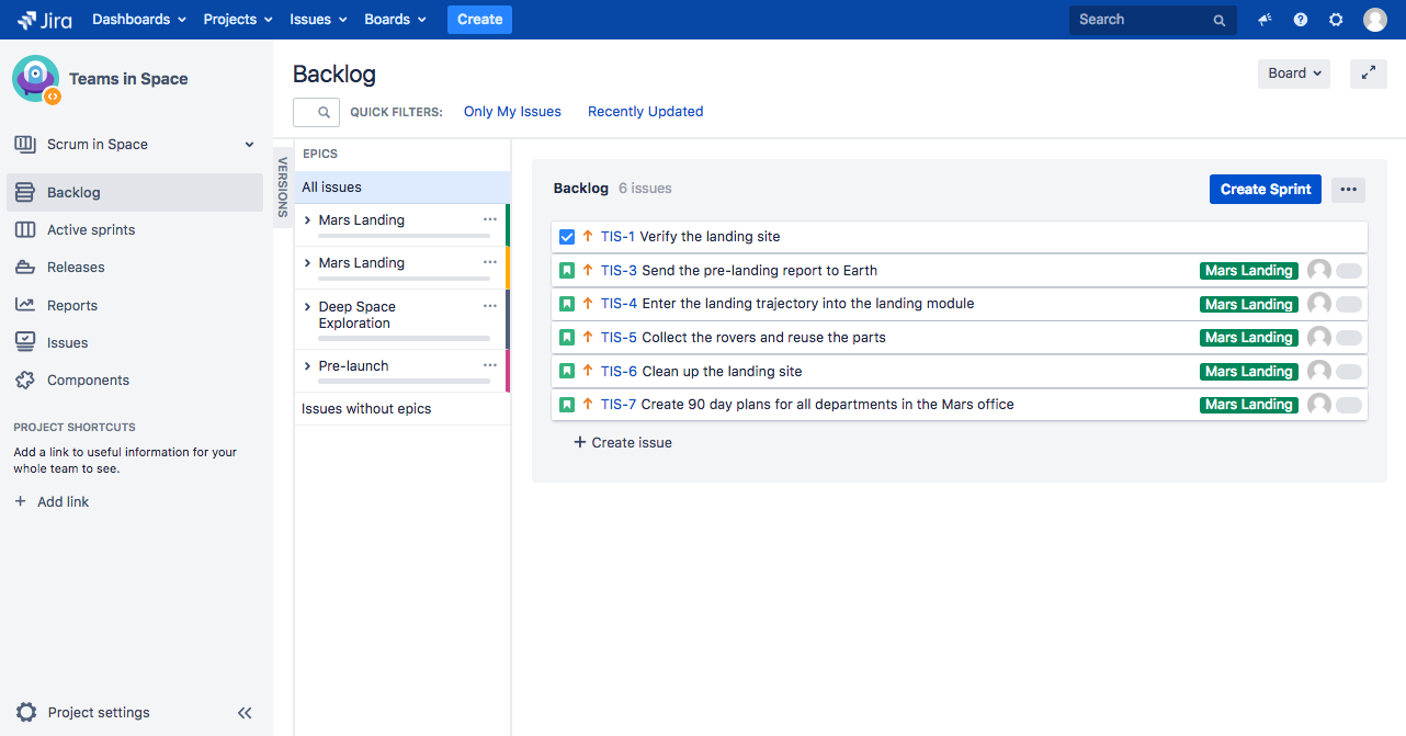
Following on the changes to the look and feel in Jira brought with Jira 7.10, we’re now updating another batch of pages. Jira 8.0 will have a new look and feel of Scrum/Kanban boards and backlogs.
UI changes
We’d recommend that you spin up the latest EAP to see the changes, but here are some screenshots to give you a better idea of what to expect.
Kanban backlog
Kanban board
Scrum backlog
Scrum board
Code changes
Issue cards: height adjustments
Until now, the height of issue cards was adjusted to the screen resolution. Normally, an issue card would take 2 lines on the screen (band-2), and in the case of low resolution, it would be adjusted to 3 lines (band-1). The adjustments would be made based on “bands” assigned to particular resolutions. Here are the classes controlling this behavior:
- Class:
gfx-plan-band-1- low resolution mode - Class:
gfx-plan-band-2- normal resolution mode
In Jira 8.0, we’re removing the concept of bands (and the related classes), which means that issue cards will no longer be adjusted to the resolution. They will always take 2 lines and behave like in the current gfx-plan-band-2. This change brings performance benefits, as calculating the width and changing the styles accordingly was taking a significant amount of time, especially with a large number of issues.
Issue cards: position of elements
In several cases, the position of elements (like priority icons, issue type icons) has changed on issue cards.


