Add a target line to your chart
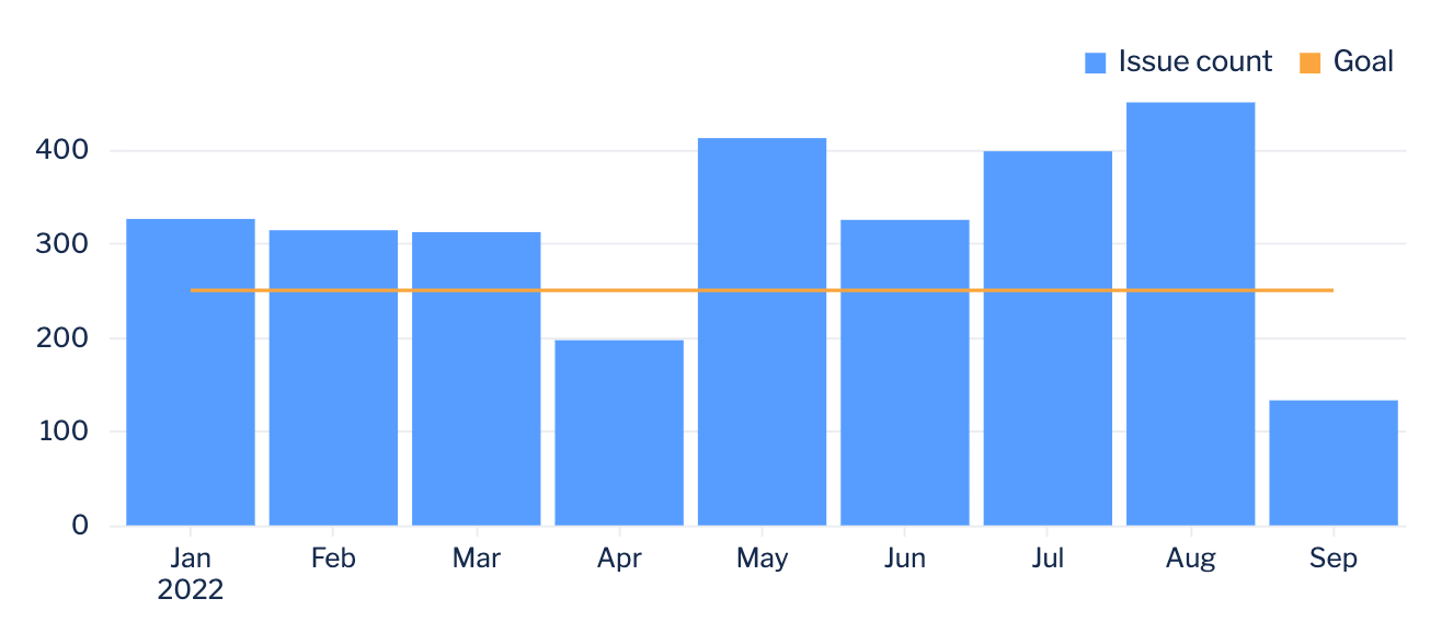
There may be times where you’re looking to compare a chart’s results against a certain data point, for example, visualizing progress of a metric against a specified goal. You can do this by adding a target line to your chart using annotations or creating a target column in your chart.
Add an annotation
You can easily add an annotation to your chart in your chart settings if you prefer to add a static target value. Annotations are especially useful if your chart has a dual y-axis or contains a large number of columns.
Annotations are available for all chart types except bubble map, funnel, map, pie, single value, single value indicator, and table.
To add a chart annotation:
Go to the Annotation tab of your chart settings.
Select the Show annotation labels on chart checkbox.
Select + Add annotation to create a new annotation.
Select which axis the value should be displayed on.
Specify the value on the chosen axis to show the annotation; the sample values below the form field show the required format.
Add a label to add text that appears next to the annotation line.
Select the color of the annotation.
Now you have a static target value as a line on your chart.
Add a target column
Another option for adding a target line is to directly add your target amount within your chart as a separate column. If your target value is already available within your database, you can simply add the column to your chart’s query.
If that data does not exist in your database, you can create a new column:
From the chart editor, add a “Formula column” step and select Custom as the formula type.
In the formula box, type in a static value, such as
250, that will show as the benchmark column.Rename the “Custom Formula” column to the desired name.
We recommend setting the chart type to a bar line chart to allow your target line to show up as a line and differentiate it from the rest of your data.
Customize your target line
When adding a target line as a column in your bar line chart, you also have the option of customizing the line’s value using formulas, variable controls, relative dates, or other non-static values.
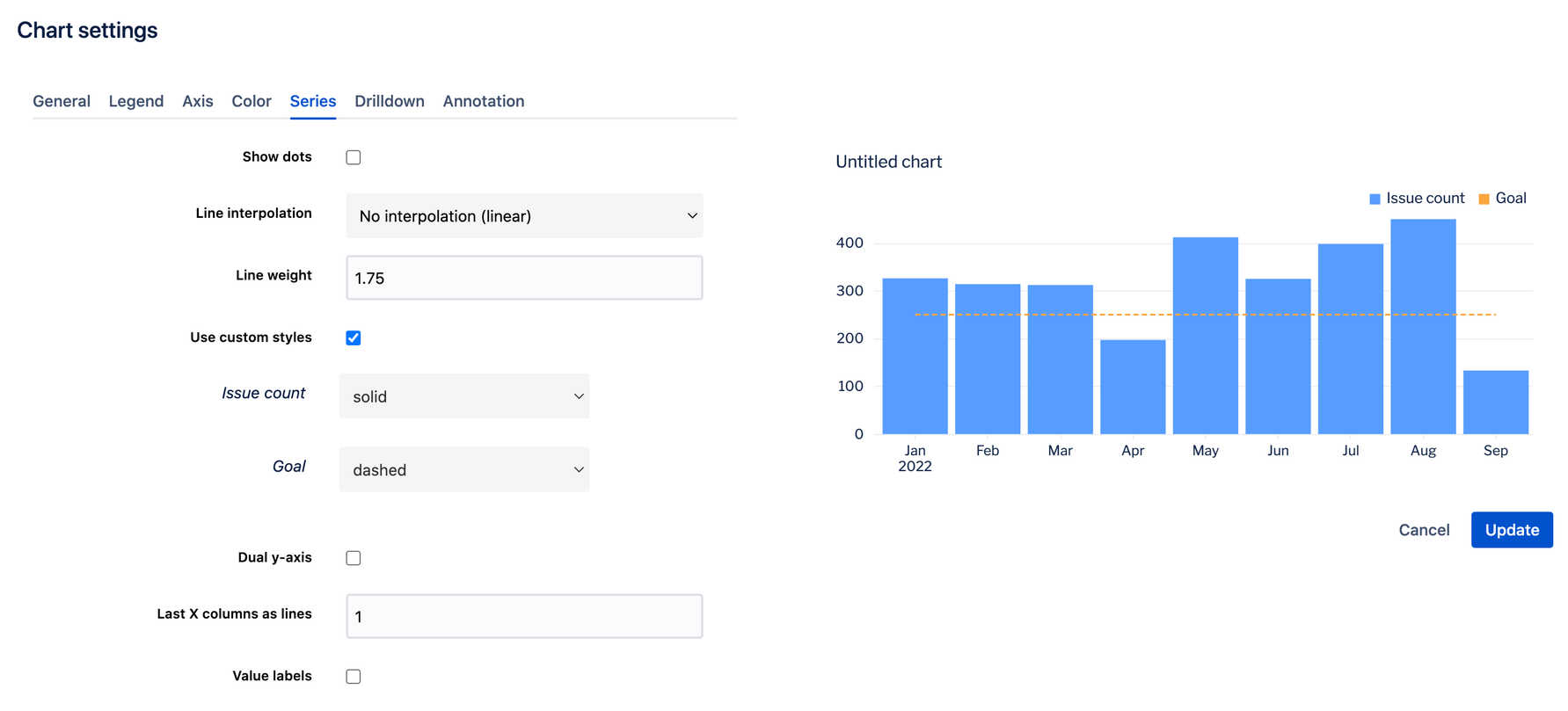
Once your target line is set, you can also customize how the line is displayed on your chart via the Series tab in the chart settings. From there, you can set a thicker line width, choose whether or not to show dots on the line, and even set how the line looks by selecting the Use custom styles checkbox and selecting the desired line style.
Make sure to select Update and save your chart once you’re done editing the settings.


