Add abbreviations or names to your maps
Map charts in Atlassian Analytics support various data types such as country codes and country names. If your data includes different naming conventions (for example, a mix of abbreviations and full names), you’ll need to decide on a single convention to properly display the names on a map chart. We recommended standardizing the naming convention in your database directly, but this is possible to do in Atlassian Analytics.
The following steps use the example of converting country codes to full country names, but the same could be done vice versa or with state codes and state names.
Convert values using a custom column
To create a custom column:
Go to your data source settings.
Go to the Schema tab.
Create a custom column in the table that contains your country codes or abbreviations. Use a
CASEstatement to change the code or abbreviations to full country names. In the following example, fit this to your needs by replacing "Country" with your column's name.
CASE WHEN "Country" = 'AU' THEN 'Australia'
WHEN "Country" = 'CA' THEN 'Canada'
WHEN "Country" = 'US' THEN 'United States'
ELSE "Country"
END
Note: This CASE statement needs to include all countries within your column for the country name labels to be applied to your chart. If some country names include abbreviations or typos, they won't be recognized on your map.
Now you can use this custom column in your visual mode queries when you’re creating map charts.
Edit your data in Visual SQL
An alternate method to using a custom column would be to edit your data directly in Visual SQL:
Edit your country column by adding a “Formula column” step with a custom
CASEstatement to change the country codes to full country names using SQLite syntax. To fit this to your needs, replace “Country” with your column’s name and modify the code to fit your use case.CASE WHEN "Country" = 'AU' THEN 'Australia' WHEN "Country" = 'CA' THEN 'Canada' WHEN "Country" = 'US' THEN 'United States' ELSE "Country" ENDHide your original “Country” column.
Add a “Reorder column” step to reposition the new custom formula column to be the first column.
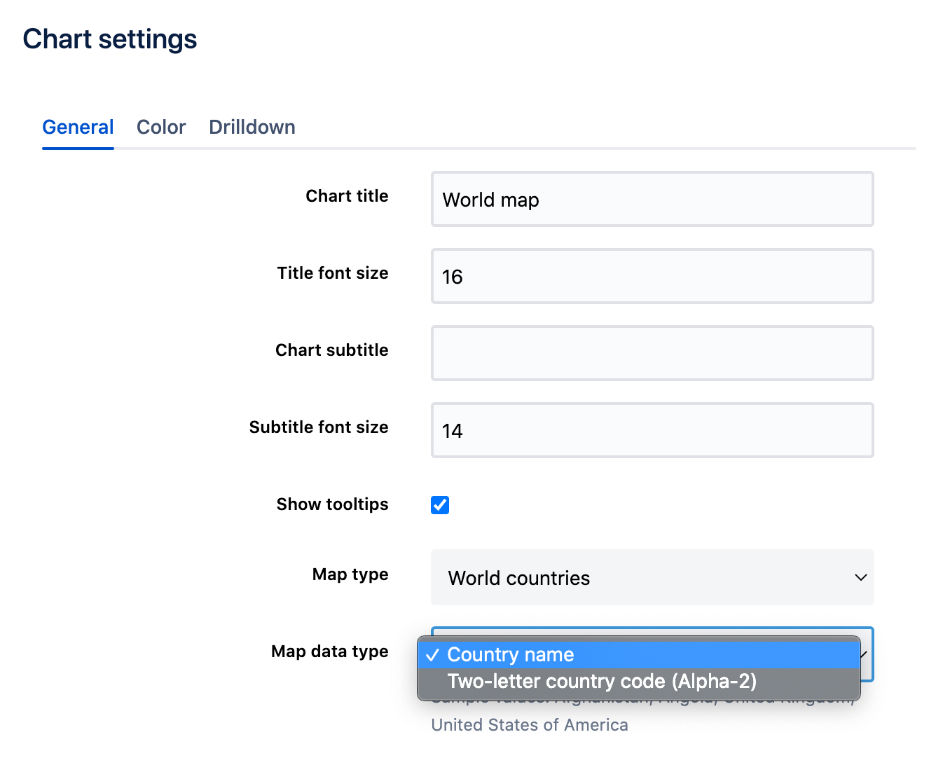
From the chart settings under the General tab, select the appropriate map data type.
Select Update when complete.
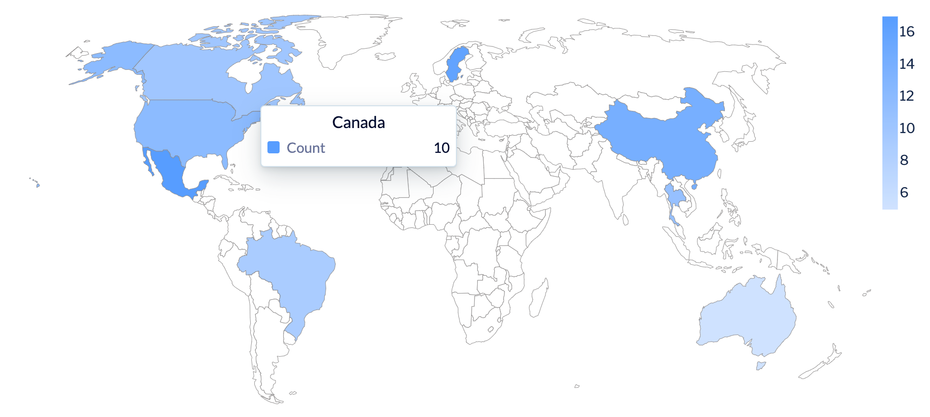
Your final chart will now display all your country data.

