Create a 2D "Date slider" control
“Date slider” variable controls are great to analyze periods of time, but flat lines aren’t very exciting… What if you could add detail to your slider to help you see sudden and unexpected upticks in your data, prompting you to dig a little deeper into what’s going on? Good news - you can! You can add another dimensionality to your “Date slider” control to look at trends and filter your charts accordingly. Here’s how you can do it:
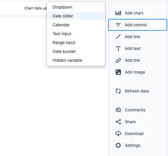
First, you need to add a “Date slider” control to your dashboard. From the dashboard sidebar, select Add control then select Date slider.
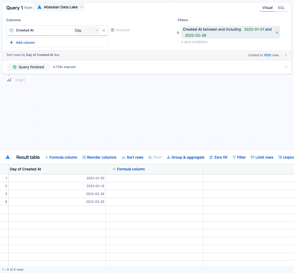
2. From there, you will be directed to the control editor where you’ll create your control. In this example, we use the Atlassian Data Lake as our data source. From the Jira issue table, add the Created at column to your visual mode query and keep the time bucket as Day.
3. Let’s say we want to filter our charts by the “Created At” column and allow the dashboard viewer to filter anywhere between the first two months of 2022. Add the Created at column to the “Filters” section and select between and including as the filter operator. Set the start and end dates as 2022-01-01 and 2022-02-28, respectively. Select Run query.
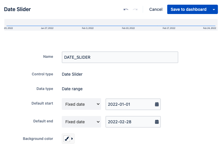
4. Now you can change the other parameters of the control in the preview pane. Change the “Default start” and “Default end” dates to Fixed date with the same date range used in the previous step. Once all the parameters are set, select Save to dashboard to place your newly created “Date slider” control on your dashboard.
5. The control looks fine as it is; however, with a flat line, we can’t see any particular areas of interest to help us narrow down which dates to explore further.
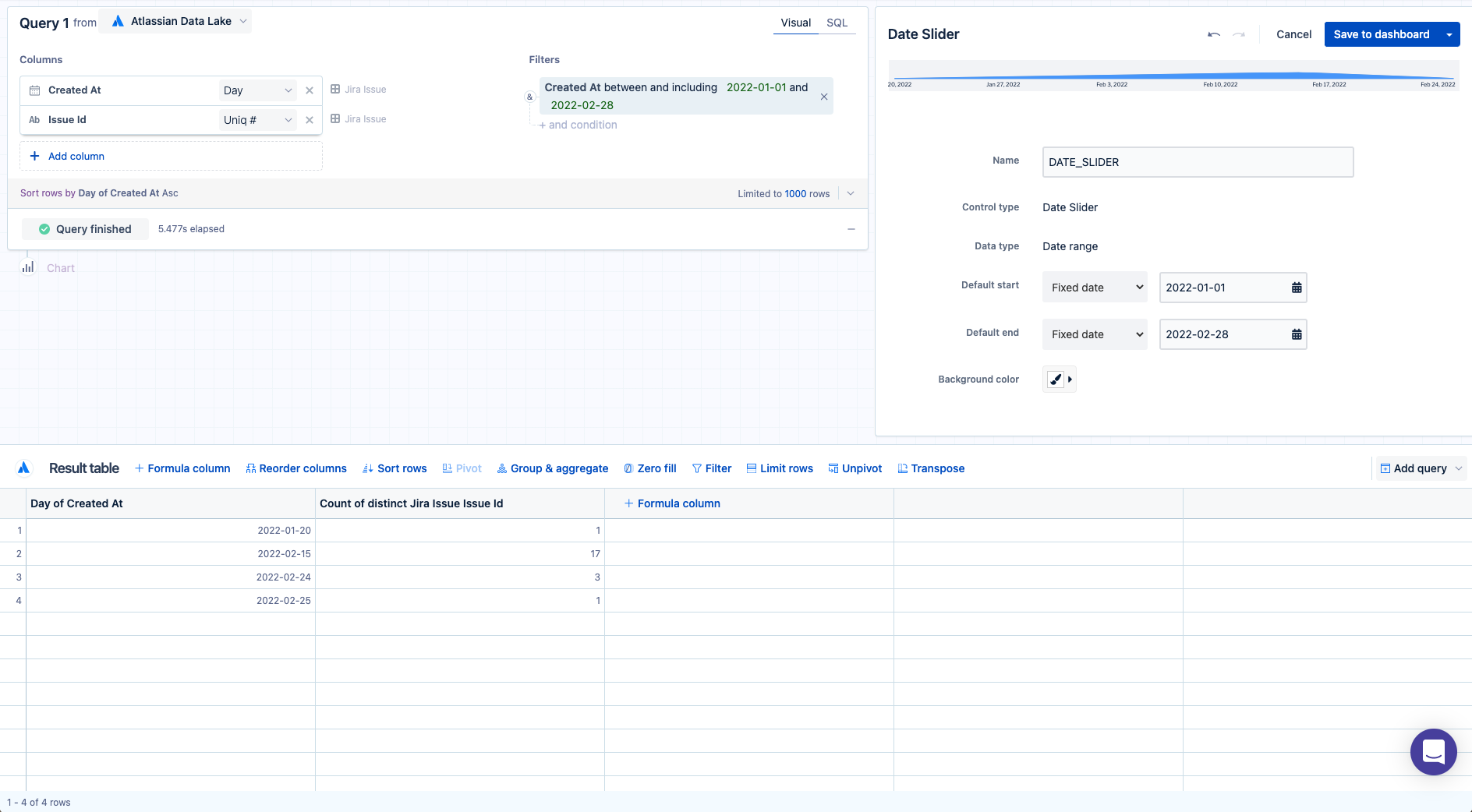
What if you’re interested in seeing the trend of new issues added to your Jira instance and how that changed over time? Edit the “Date slider” control to go back to the control editor. From the same Jira issue table, add the Issue ID column to your visual mode query and select Count of distinct from its aggregation menu. Upon running the query again, you’ll see the issue count trend added to the “Date slider” control. Now our “Date slider” control is more insightful.
6. Select Save to dashboard to place your newly updated control on your dashboard.
Adding numeric data to your “Date slider” control is a great way to add further visibility into the time period being analyzed. On your dashboard, if you see a spike in your data as we do in this example, you can dig deeper into what’s going on by dragging the start and end points of the “Date slider” control around the uptick and looking at the data to see the details and other metrics around it.


