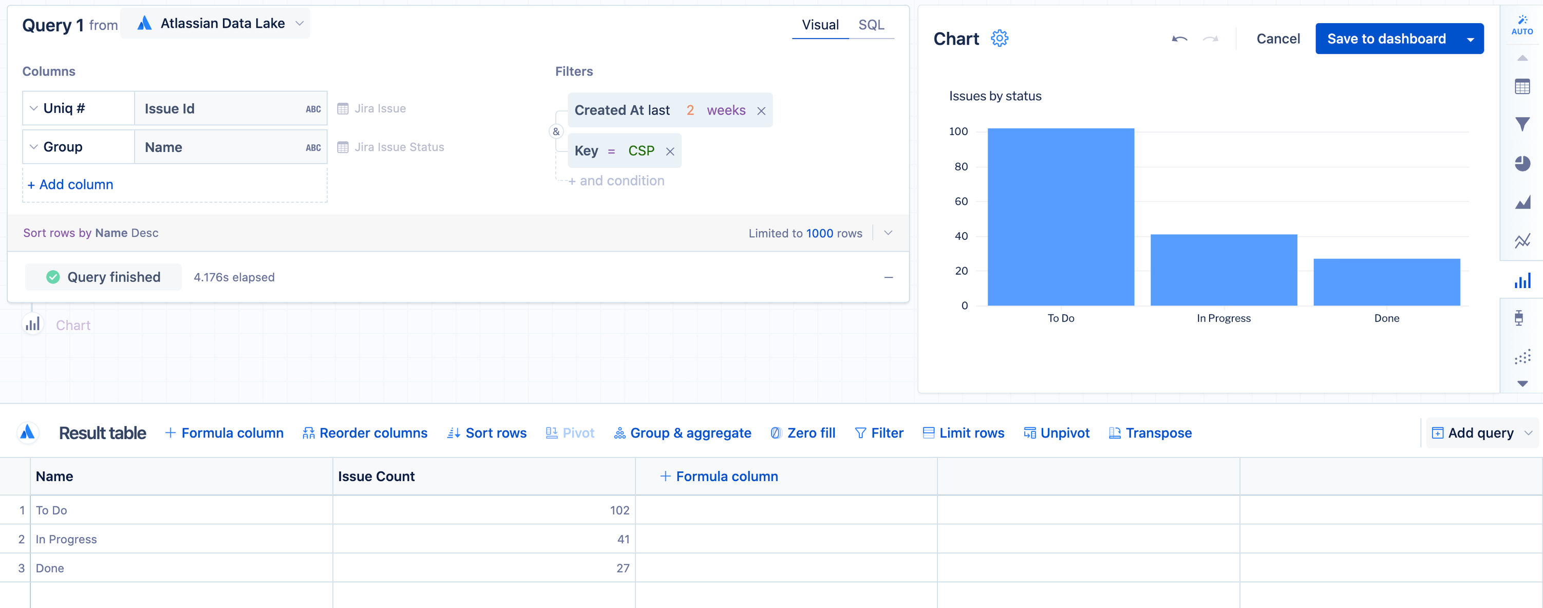
Create a multi-color bar chart
By default, a bar chart created with only two columns results in all the bars having the same color. To set a different color for each bar, additional steps are required.
To create a multi-color bar chart:
Start with a bar chart displaying a single category.
Add the category column to the query again. In this example, we added the “Name” column from the “Jira issue status” table again.
Select Run query.
Edit the chart settings to set custom series colors if desired.
Now you have a multi-color bar chart. Atlassian Analytics will generate this as a multi-color bar chart because it automatically pivots on the second column and detects the different categories in the data.
If the second column in your final result set is numeric, you’ll need to manually add a “Pivot” step.
If you use a “Formula column” step to copy the category column again, use a “Reorder columns” step to move that new column so it is second from the left in the final result table.

