Create a pacing chart
For most companies, the consistent tracking of progress towards an objective can be key to making wise forecasting decisions. A tool to accomplish this is a pacing chart which displays two key points of data:
Your current/actual progress toward a time-based objective
The hypothetical progress you’d need to achieve that time-based objective
Pacer charts can come in many forms: bar chart, bullet chart, single value chart, or really any form you’d like. The pacer data point (hypothetical progress) calculation can be as complex or as simple as you’d like. It can be based on historical data (e.g., actual figures or progress from the last quarter), a complex curve, or a linear progression.
In this example, we’re going to focus on a simple linear progression and display the points in a bar chart.
Create a “Text input” control where you can set or adjust the goal. From the sidebar on a dashboard, select Add control and then choose “Text input”. Name it something useful (e.g., NEW_ISSUE_TARGET) and make sure the data type is set to “Number”.
Next, create a chart where the first dataset is your actual metric for the current period. This example represents the total number of Jira issues resolved in the current month.

3. Add a new Query to the chart which will be used to calculate the pace. You could make this formula as complicated as you’d like, but we’re just going to map out equal progress each day of the month. We want to get the following calculation:
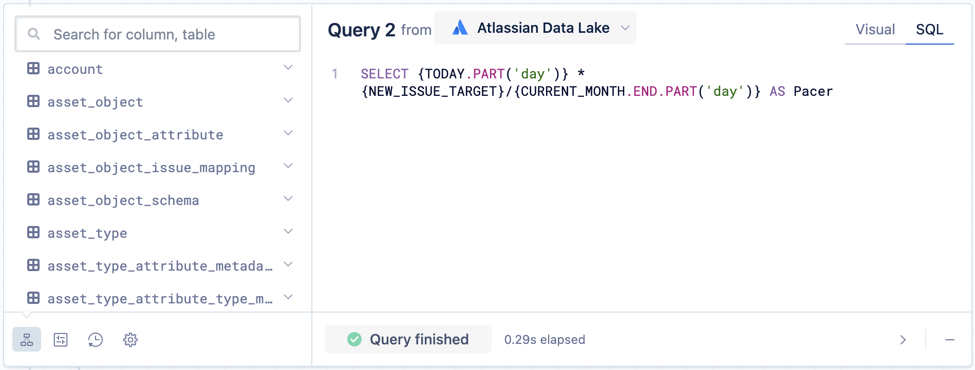
(current day of the month) * TARGET / (# of days in the month)You could do this in SQL, but Atlassian Analytics has some helpful relative date variables and datetime functions you can leverage. We’ll use the {TODAY} and {CURRENT_MONTH.END} relative date variables and the PART() datetime function. Toggle your second query to SQL Mode and run the following SQL statement:
SELECT {TODAY.PART('day')} * {NEW_ISSUE_TARGET}/{CURRENT_MONTH.END.PART('day')} AS Pacer{TODAY.PART('day')}: The current day of the month{NEW_ISSUE_TARGET}: The TARGET we set with the “Text input” control created in Step 1{CURRENT_MONTH.END.PART('day')}: The last day of the month—to get how many days there are in the current monthAS Pacer: Names the resulting column “Pacer”
4. Select Run query. By default, the queries are merged with an outer join. Edit the join step and change the join type to Union and select include query names. Select Save to apply the changes.
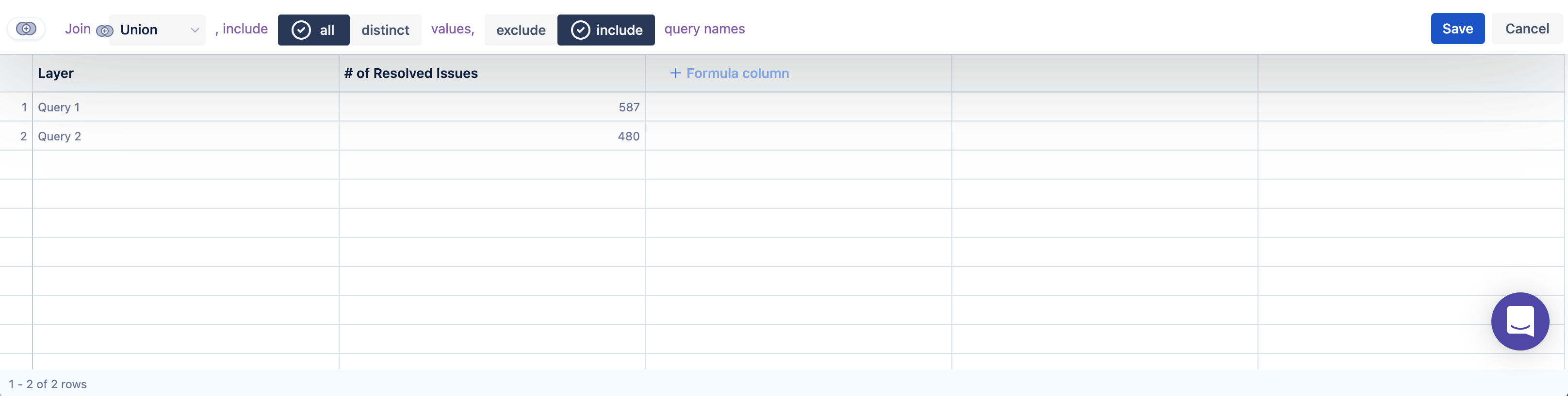
5. As is, the bar chart shows “Query 1” and “Query 2” as the bar labels. Use an “Apply formula” step on the “Layer” column, select Custom for the formula type, then use the following CASE statement to change the values from “Query 1” and “Query 2” to “New Issues Resolved” and “Pacer”, respectively:
CASE WHEN "Layer" = 'Query 1' THEN 'New Issues Resolved' WHEN "Layer" = 'Query 2' THEN 'Pacer' END
6. Select the gear icon above the chart preview to open the chart settings and customize your chart.
a. Title the chart New Issues Resolved and Pacer.
b. Go to the Axis tab in the chart settings. Under Y-Axis, set the Maximum value to the same value as your goal. This will help you get an idea of how close you are to your target.
c. Select Update to save your chart settings.

7. Select Save to dashboard to save your chart and arrange it on your dashboard.
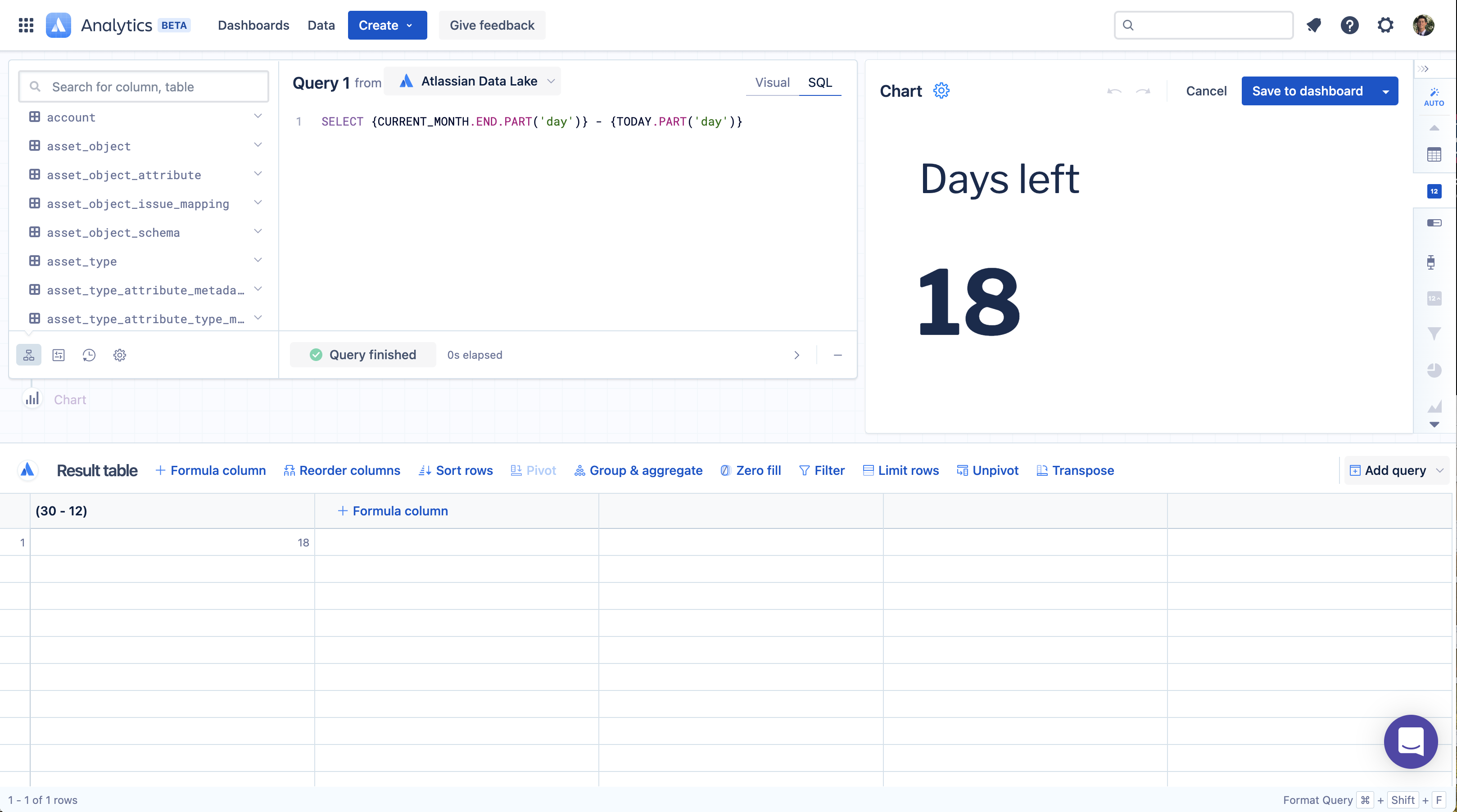
8. Now create another chart to show how many days are left in the month. Toggle to SQL mode and use the following SQL statement:
SELECT {CURRENT_MONTH.END.PART('day')} - {TODAY.PART('day')}9. Select Single value as the chart type, give the chart the title of Days left, then save it to your dashboard.
Now you’ve got the makings of a pacing dashboard with some great potential!

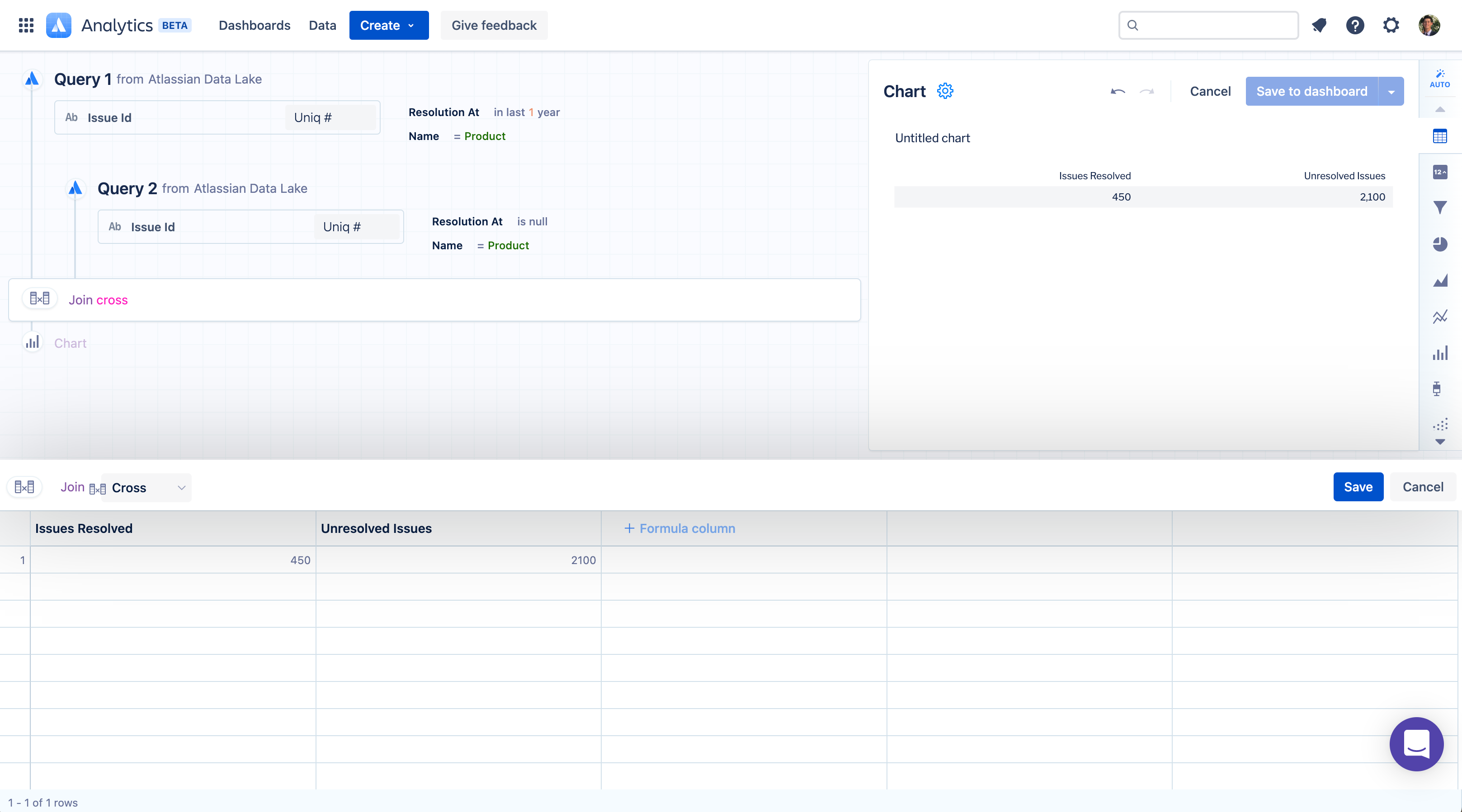
In this next example, we’ll create a pacing chart which estimates the completion date of a project based on the number of issues resolved in the last year and the current number of unresolved issues. This example follows the same logic used in the Predicted completion date chart on the Jira Software - Issues Overview starter dashboard.
First, create a visual mode query that pulls in a count of issues that have been resolved in the last year. In this example, we include a project filter to only include data from our Jira project titled Product, but you can choose to include any additional filters you may need.

2. Next, write a second query that pulls in a count of unresolved issues. This second query should include all of the same filters as your first query, except you will want to change the “Resolution At” filter to filter for where “Resolution At” is null.

3. Edit the “Join” step to use a Cross join then select Save. By default, Atlassian Analytics will want to use an outer join, which is incorrect for this chart example.
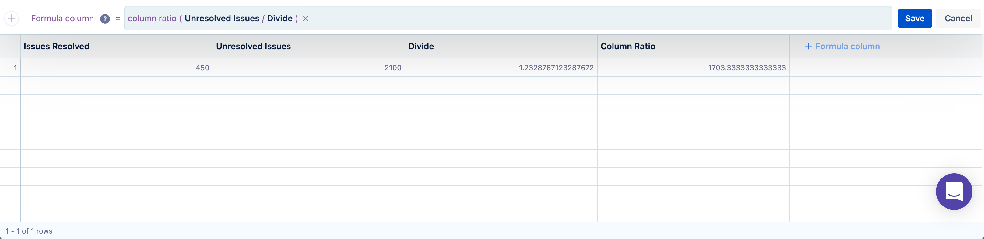
4. Next, add a “Formula column” step and use the Divide formula to divide your “Issue Resolved” column by 365. This gives us an issues resolved per day calculation.

5. Add another “Formula column” step, this time we will use the Column ratio formula. Use this formula to divide “Unresolved Issues” by the “Divide” column which calculates issues resolved per day. Optionally rename this column to “Days Until Complete”.
6. Add one final “Formula column” step, and this time select the Custom formula option. Use the following custom formula to calculate the predicted date of completion:
DATEADD({TODAY}, "Days Until Complete", "day")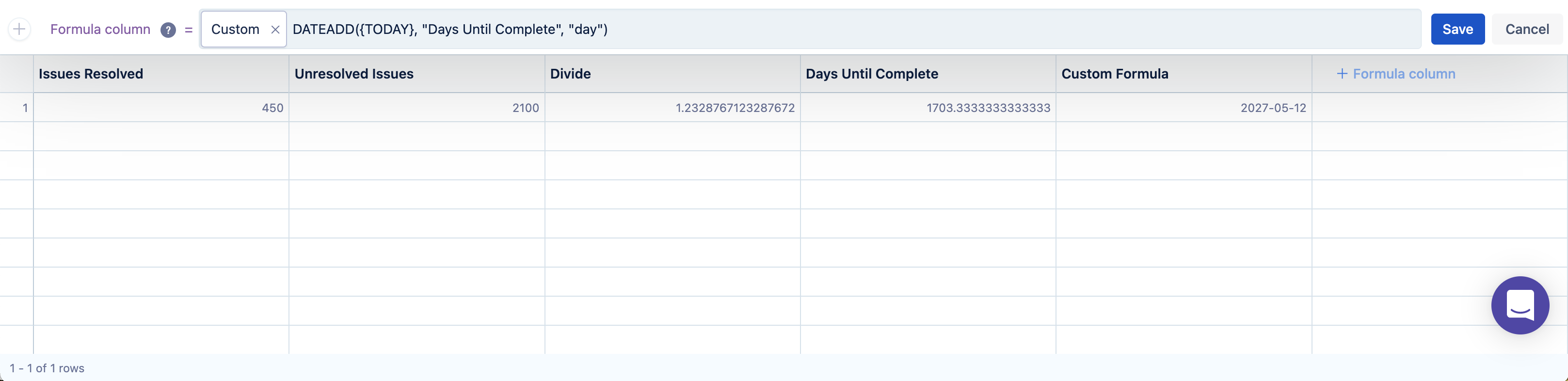
7. Optionally, rename the above “Formula column” step to something such as “Rolling Predicted Completion Date”. Hide all other columns and display this value as a single value chart.

8. Select Save to dashboard to save your new “Predicted completion date” pacing chart. ![]()
