Burnup Chart
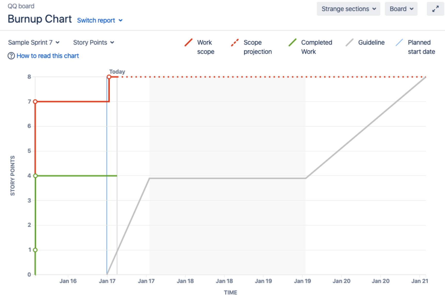
The Burnup Chart provides a visual representation of a sprint's completed work compared with its total scope. It offers insights on your project's progress, as well as offers warnings to help you maintain your project's health; you can instantly identify problems such as scope creep or a deviation from the planned project path.
Before you begin
- The Burnup Chart only applies to Scrum boards.
- Story Points on sub-tasks are not included in the Burnup Chart. (Only Story Points on parent tasks are included.)
Viewing your chart
- Click Projects then select the relevant project.
- Click Reports, then select Burnup Chart.
- To choose a different sprint, or a different measurement for the vertical axis, simply click the drop-down menus.
You can view the Burnup Chart for individual sprints in your project, meaning you can see the amount of work completed vs the amount of work remaining on a day-to-day basis.
Understanding the Burnup Chart
- The vertical axis represents the amount of work, and can be measured in different ways such as story points, issue count, or estimates. The horizontal axis represents time in days.
- The chart shows the red work scope line and the green completed work line (completed stories, tasks, fixed incidents for example) in relation to the grey Guideline, which is a theoretical line showing the daily completion necessary to meet the deadline.The distance between the lines on the chart is the amount of work remaining. When the project has been completed, the lines will meet.
- The spikes in work scope mean that something has been added to the milestone while spikes in completed work mean a story has been completed. This information can be crucial at retrospective to understand if, for example, too much work has ben added or the work has been more complex than estimated.
- Examine the 'Work scope' line to identify any scope creep.
- You can examine the actual and planned start and end dates for each sprint.

