JIRA Software reporting
One of the great things about JIRA Software is that it gives you the ability to visualize data in many different ways. Dashboards and gadgets are a big part of that strategy, but are there other ways to see and understand your data? Of course there are! JIRA Software ships with a number of preconfigured reports that emulate many of the gadgets. What’s the difference between reports and gadgets? There are two main differences:
- Reports have a unique URL which makes direct linking easier
- Reports are also in a printer-friendly format that lets you print directly or export as a PDF
JIRA Software's reporting framework is also extensible. This means there are add-ons that you can install to add additional reports from the Atlassian Marketplace. How do you access these reports? Just go to the projects drop-down in JIRA Software's header then click the particular project you want to report on.

You'll then find reports in the sidebar:

Let’s take a look at three reports. The created vs. resolved gadget and its report version share a number of the same features. The report version, however, is more focused on a detailed review, whereas the gadget focuses on a quick glance. Let’s take a look at the report output:

The report shows the chart with detailed data for each interval. It maps created issues versus resolved issues over a period of time, and can help you understand whether your overall backlog is growing or shrinking. Note that the gadget does have the same detailed functionality. Just click the expand icon in the gadget’s header.
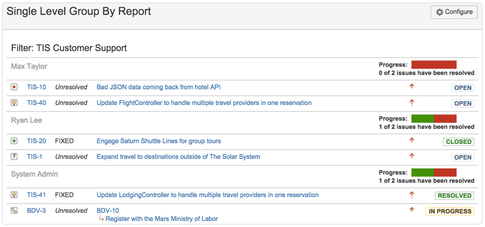
The single level group by report organizes issues by a configurable field. It has a progress bar displaying how many of the issues are resolved within each group. I've found this report useful when looking at a release and seeing how my team is tracking against that release. I scan the right-hand column looking for large areas of red as I get close to release. In the same vein, I run the same report using priority. I focus on open issues in high-priority areas.
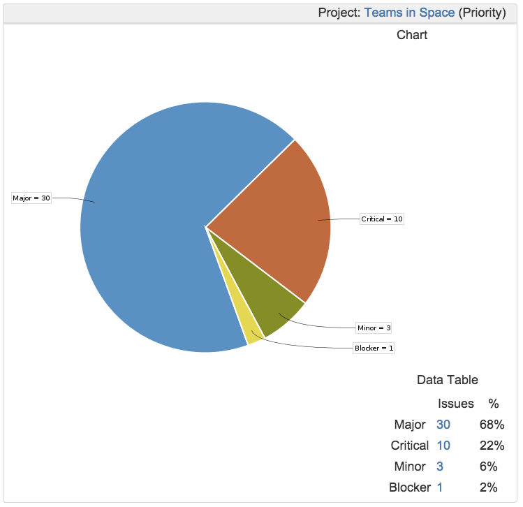
The pie chart report shows issues for a project or filter grouped by a specific field. It lets you see the breakdown of a set of issues at a glance:
The number and types of reports available to you depends on whether you have JIRA Software Cloud or the server version. The Atlassian Marketplace has a number of additional reports for installation into your instance, too.
Hungry for more?
Watch the blogs in this space to get notified when new tips articles like this are posted. And if that's still not enough, sign up for JIRA Insiders – our monthly newsletter covering all things JIRA.
![]() Written by Dan Radigan, Technical Account Manager
Written by Dan Radigan, Technical Account Manager