Comparing different methods of calculating the rolling average on the Control Chart
The new Control Chart uses a different calculation for the rolling average, than the old Control Chart. On this page, we compare different methods for calculating the rolling average, and show how the issue-based calculation (Example 3) is better.
Consider how the rolling average (blue line) is mapped in the examples shown below. All three examples use the same data:
Example 1: Window based on time, centered on each day
In this example, the rolling average is calculated and mapped for each day on the chart. This calculation is used in the old Control Chart.
On each day, the average is calculated by doing the following:
- Determine a window of time (e.g. two days), based on the overall timeframe of the chart.
- Use the issues in the window to calculate the average cycle time.
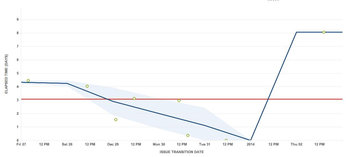
One-week timeframe (one-day window)
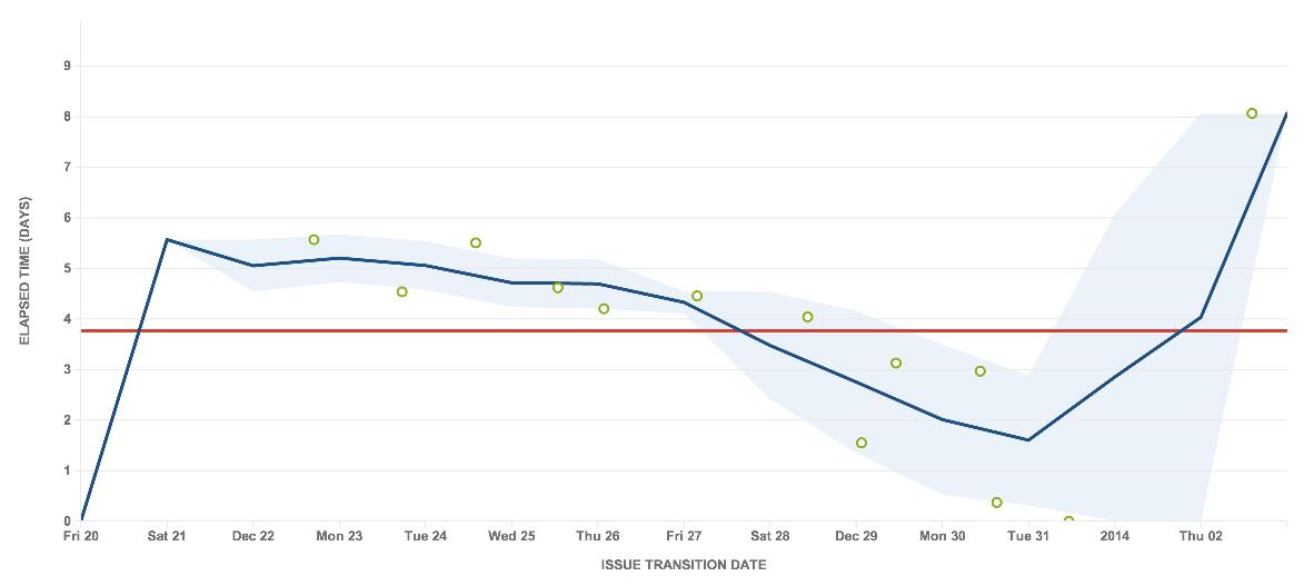
Two-week timeframe (two-day window)
This approach has a number of problems. In these charts, you can see that the last issue is clearly an outlier. However, as it is too far apart from other issues, the rolling average line simply jumps up, particularly in the one-week timeframe. The rolling average line also bends at unexpected places on the chart.
The one-week timeframe also shows no standard deviation (light blue shaded area) around the outlier, although it is a bit better when zoomed out to a two-week timeframe. However, the two-week timeframe shows other problems — the rolling average rises and even fluctuates before the very first issue.
Example 2: Window based on time, centered on each issue
In this example, the rolling average is calculated and mapped for each issue on the chart.
At each issue, the average is calculated by doing the following:
- Determine a window of time (e.g. two days), based on the overall timeframe of the chart.
- Use the issues in the window to calculate the average cycle time.
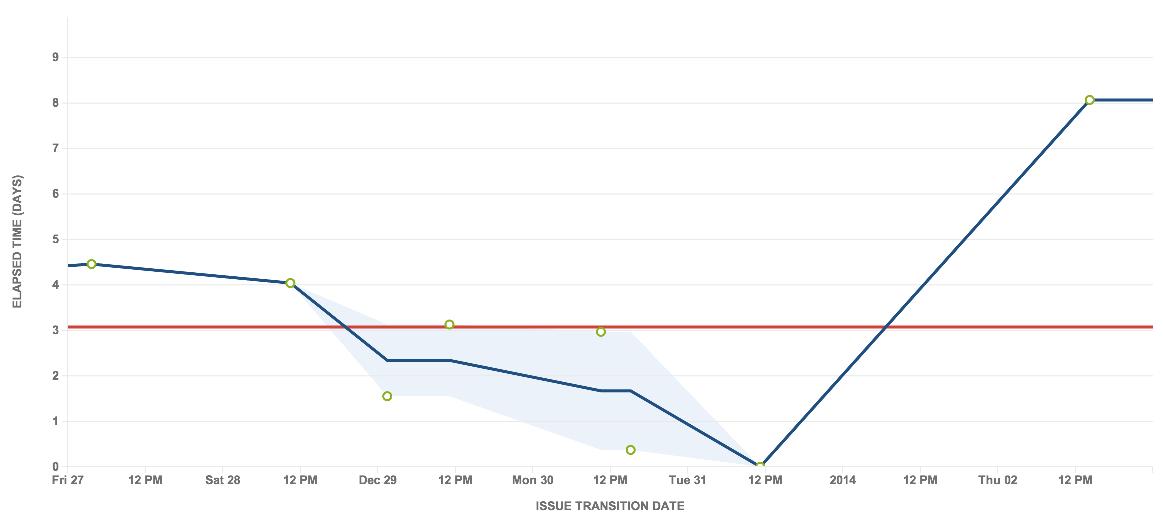
One-week timeframe (one-day window)
Two-week timeframe (two-day window)
This chart is the same as the one on the left, but is zoomed out to two weeks, i.e. includes an additional week prior to the original.
This approach is better than the approach in Example 1. By centering around the issues points, the variation in the moving average line is easier to understand — each completed issue causes a change. The moving average also starts at the first point, instead of moving up from zero.
However, note that the outlier is still not handled well. The rolling average still jumps up and shows no standard deviation.
Example 3: Window based on a number of the total issues, centered on each issue
In this example, the rolling average is calculated and mapped for each issue on the chart. This calculation is used in the new Control Chart and is described in more detail in Control Chart.
At each issue, the average is calculated by doing the following:
- Take a set number of issues (e.g. five issues), based on the total number of issues in the chart.
- Use the issues in the window to calculate the average cycle time.
One-week timeframe
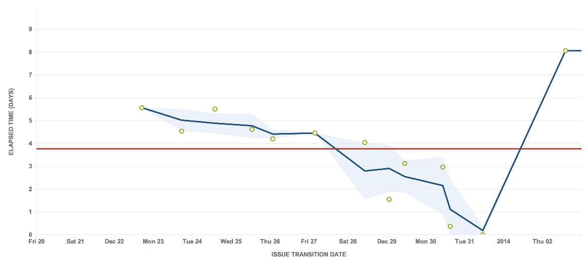
Two-week timeframe
This approach improves upon both Example 1 and Example 2. The window is not time-based, but is based on the number of issues — in the charts above, it includes two issues ahead and two issues behind.
The rolling average starts at the first data point and the variations are easy to understand. In addition, it handles the outlier better. The rolling average is a more steady line towards the right of the chart, and clearly shows the last issue as an outlier with the appropriate standard deviation.


