Accessibility
We want every team around the globe to be able to use Jira with the least amount of trouble, and the accessibility settings bring us closer towards this goal. Whether your vision is impaired, you can't really tell colors apart, or just strongly believe that blue, azure, and sapphire are the same thing—we've got you covered.
More accessibility improvements!
Accessibility in Jira is not a one-time effort—we're constantly reviewing our VPAT report and fix accessibility issues in almost every Jira version. For more info, see Accessibility improvements in Jira.
Changing your accessibility settings
You can personalize your accessibility settings to make it easier to work with Jira. To change the settings, click your user avatar and select Accessibility. You can choose the following options:
- Underlined links
This option underlines all hyperlinks around Jira to make them more visible.
- Patterns on issue statuses
This options adds unique patterns to issue statuses to distinguish between them more easily.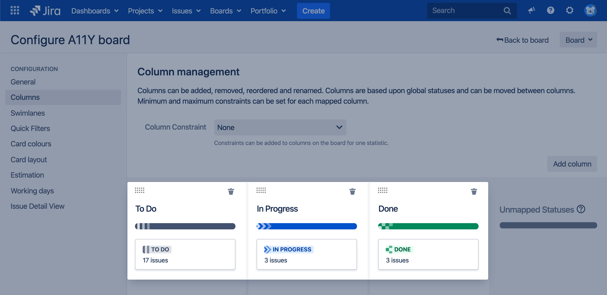
- Increased text spacing
This option increases text spacing between characters, words, lines of text, and paragraphs.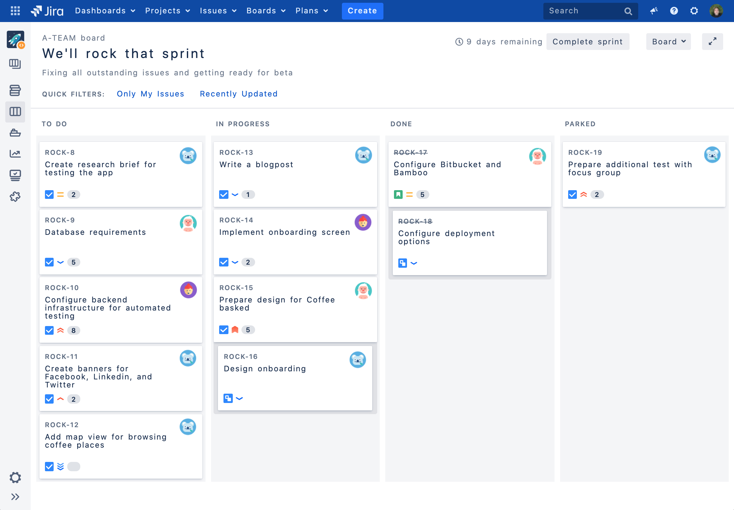
- Background in subtle buttons
This options adds a gray background to subtle buttons (normally displayed on hover) to make them more prominent.
For app developers
If you’re an app developer, you can make your app add new options to accessibility settings. For more info, see Accessibility for app developers.