Make the most of the data pipeline with the DevOps dashboard
The DevOps dashboard template gives you a glimpse of what’s possible with the data pipeline. The template offers useful insights into the health of your engineering teams. We hope it will also provide a great jumping off point for creating your own dashboards and reports.
Download the template:
With the comprehensive data available for people, projects, and issues in the data pipeline, managers and business leaders can identify trends in productivity, quality, responsiveness, and predictability of work. While the Jira UI is focused on getting work done, dashboards and reports like this one provide insights on a macro level.
In this guide, we’ll provide some explanation of the metrics we’ve included, how they’re calculated, and what they might indicate about your team.
If you want to dive straight into connecting the template to your own data source, see:
DevOps dashboard at a glance
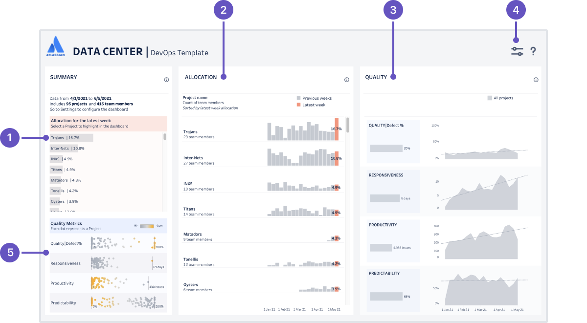
Here’s the DevOps dashboard in Tableau, populated with the sample data included with the template.
- Project summary lists the projects (or project categories if you choose to aggregate by category) featured in the dashboard, and shows the percentage of resources directed towards a project (measured by issues closed by team members). This list also acts as a filter for the report, if you want to drill down and see data for a specific project or project category.
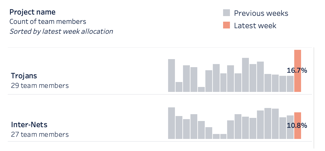
- Allocation metrics shows the percentage of resources directed towards each project (measured by issues closed by team members) to projects or project categories each week during the reporting period.
- Quality metrics charts the quality, responsiveness, productivity and predictability metrics for all projects or project categories.
- Dashboard settings configure the data to be included in the dashboard, including the date range, project or project category aggregation, and issue types to include.
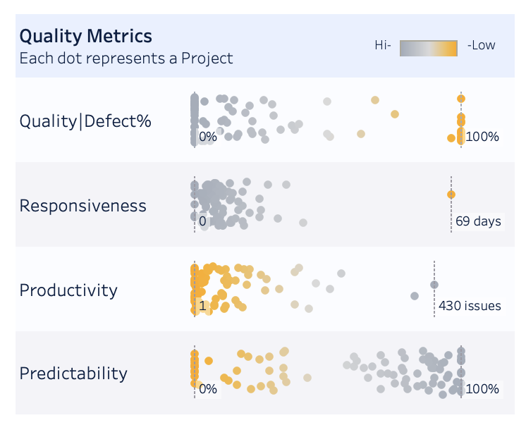
- Quality summary shows aggregate values for each of the four quality metrics by project, to help you identify outliers or systemic problems (or successes).
DevOps metrics in detail
For the explanations below we’ll assume you aggregate data in the dashboard by project. However, you can also choose to aggregate by project category. The concepts are the same for either option.
Allocation
In the DevOps dashboard, the project allocation section shows the percentage of your team directed towards a project. This data can help you ensure you have coverage of your most important projects.
How is it calculated?
Because Data Center applications don’t have the concept of a "team", we’ve used issues closed by a person as a proxy. We treat the people who closed issues in a project as ‘team members’ for the purposes of that project. You can filter the report to only include particular people in a team or department.
It’s worth noting that allocation is not indicating effort or time spent. The best way to explain how allocation is measured, is with a few examples.
What does it indicate?
This metric helps you identify trends, and see where you may be able to re-deploy people onto projects with higher importance to the business.
This data can also be used in conjunction with the rest of the dashboard data, to see the impact of higher or lower allocation levels on other metrics.
Screenshot showing allocation metrics for two projects
Quality (defects)
In the DevOps dashboard, we approach quality from an engineering health point of view. When left unchecked, technical debt will impact your team’s ability to deliver quality software. By examining how you prioritize fixing defects over new feature work, you can spot trends that may indicate an engineering health problem.
How is it calculated?
Quality = Defects resolved / total issues resolved x 100
Put simply, of all the issues resolved in a given week, what proportion were bugs and other ‘defect’ issue types. Remember, we’re focused on engineering health indicators, not product or end-user experience quality.
You can define which issue types to treat at ‘defects’ in the dashboard settings. For example, you may have different issue types for bugs, architectural tech debt, and failing tests that can all be classed as ‘defects’ in the dashboard.
What does it indicate?
A steady line indicates the team is balancing technical debt with new feature work. That’s an indicator of a stable system with good engineering health.
If the line starts trending up (as in the example below), it might indicate that developers delaying working on defects until the end of a project, or you the team’s focus has shifted to new feature work.
If the line starts trending down, developers may not be paying enough attention bugs, and you may have a quality issue in future.
If there are many sharp peaks and troughs, it would be worth delving deeper, and finding out what was happening during those weeks. There may be some team specific context you’re missing, such as an incident or release deadline. You may also want to filter the dashboard by a specific project to see if the trend is noticeably different to the aggregate for all projects.
Screenshot showing Quality (defect) chart for one project, compared to all projects
Responsiveness
In the DevOps dashboard, the responsiveness chart indicates how fast a team is completing work, by measuring the time to completion.
Responsive teams are extremely valuable to the business. They quickly deliver user facing value on a known cadence. With smart investments, you can build a strong and responsive team which enjoys the work, keeping customers and the business happy, without sacrificing the other dimensions long-term.
How is it calculated?
Responsiveness = resolution date - created date
The value is expressed in days. Only issues that were completed within the given time frame are included.
What does it indicate?
The solid lines indicate actual time to completion, and the dotted line indicates the direction it’s trending.
A steady line indicates the team is able to deliver customer facing value quickly. It may indicate good estimation practices, as work is broken down into similar sized, manageable chunks.
If the line is trending up, the team is taking longer to complete issues and deliver value. This may indicate an issue sizing and estimation problem in the team.
If the line is trending down, the team is taking less time to complete issues. Generally this is a good trend, but again, it can indicate an issue sizing or estimation problem.
Sharp peaks indicate the average time to complete an issue was higher than usual. It might be worth investigating what issues were completed in the time period, to see if the problem was caused by a single issue, or resourcing issues.
Screenshot showing the responsiveness chart for one project, compared to all projects.
Productivity
In the DevOps dashboard, the productivity chart indicates the quantity of work being delivered.
How is it calculated?
Productivity = number of issues completed
This is a simple metric that shows the volume work that meets the team’s definition of done in the given time period.
What does it indicate?
A steady line indicates the team is working through a similar number of issues in a given time period. This can be an indicator of a stable workload, as a result of good estimation and sprint planning.
Sharp peaks and troughs may indicate a problem with workload, or with estimation. It could be worth delving deeper, and finding out what was happening during those weeks, and perhaps comparing this data to the allocation data for the same period.
Comparing a single project to all projects can be daunting, but focus on the shape of the line, rather than the difference in the number of issues.
Screenshot showing productivity chart for one project, compared to all projects
Predictability
In the DevOps dashboard, the predictability chart indicates how consistent the pace of work is, by comparing the number of issues started (transitioned to an ‘in progress’ status) with issues completed over time.
How is it calculated?
Predictability = issues completed - issues started
While responsiveness is measured in time (days), predictability focuses on the flow of work, specifically the volume of work that is started versus work completed within the same time frame.
What does it indicate?
Ideally, the number of issues started and completed in a given period should be about the same, around 100% on the chart.
A value greater than 100% positive value indicates that more issues were completed than started. This is a good trend, but may indicate that people aren’t picking up new tasks after completing a task.
A value lower than 100% indicates more issues were started than completed. This may indicate that work items are too large to be completed within the time frame, or that the team is starting too many things, and could benefit from some work in progress limits.
Screenshot showing predictability for a project, compared to all projects.
Quality summary
In addition to the individual charts for quality, responsiveness, productivity, and predictability that allow you to compare one project to all projects, you can also see a summary view which shows the aggregate value for each project individually.
What does it display?
Aggregate for each project
For example, the responsiveness chart will show the aggregate time to completion for an individual project in the reporting timeframe.
When reading this chart, remember that only the x-axis is important. The y-axis is spacing the projects out randomly, so the dots don’t overlap. Hover over each dot to see the project name and value.
What does it indicate?
This helps you identify projects that are outliers, where it might be beneficial to investigate further.
You may also observe organization-wide trends that may indicate a bigger engineering health or agile craft problem.
As with the other charts, it can be useful to contrast the data with the allocation data. Perhaps the reason for low productivity and responsiveness is due to too few team members contributing to the project.
Screenshot showing the quality summary for all projects in the dashboard scope
Configure the dashboard settings
Once connected, you can configure the dashboard to show particular projects, team members, and time periods.
To configure the dashboard:
- Select the Settings icon on the dashboard.
- Set any date, project, team, and issue settings. Refer to the table below for information on each setting.
- Select the Close icon to close the settings pane.
Here's a summary of the available settings.
Settings | Description |
|---|---|
Date range | Drag the slider to set the start and end dates to report on. The dashboard can only show data for the date range included in the data pipeline export. |
Time granularity | Select whether you want to display charts by week, month, quarter or year. |
Dashboard aggregation | Select whether to report by project, or by project category. |
Projects / project categories | If aggregating by project, select specific projects to report on. If aggregating by project category, select specific project categories to report on. The list will include all projects or project categories included in the data pipeline export. |
Team members | Select a sub-set of users to report on. By default this field returns user ID. You may be able to change the query to select by user name or full name, if that data is available. |
Issue types | Select the issue types to include in the dashboard. For example you could choose to exclude Epics or Service requests. |
Defect issue types | Select the issue types you want the dashboard to treat as ‘defects’. This is used in the quality metric to indicate the effort spent fixing bugs and other defects. |
Make your data work for you
We hope the DevOps template has given you a valuable insight into your team’s current engineering health, and sparked a few ideas for how you can use the data pipeline data to make better business decisions.
You should treat this template as a jumping off point. The way we have chosen to calculate the metrics may not suit the way your teams work. Take the responsiveness and productivity charts for example. We’ve used an issue as the basic unit of measurement. This works great for Kanban teams, where we can expect issues to be of a similar size. However for a scrum team, you may find it better to use story points as the unit of measurement, so you can measure the average completion time per story point, rather than per issue.
Ready to get started?


