Create a dual axis line chart
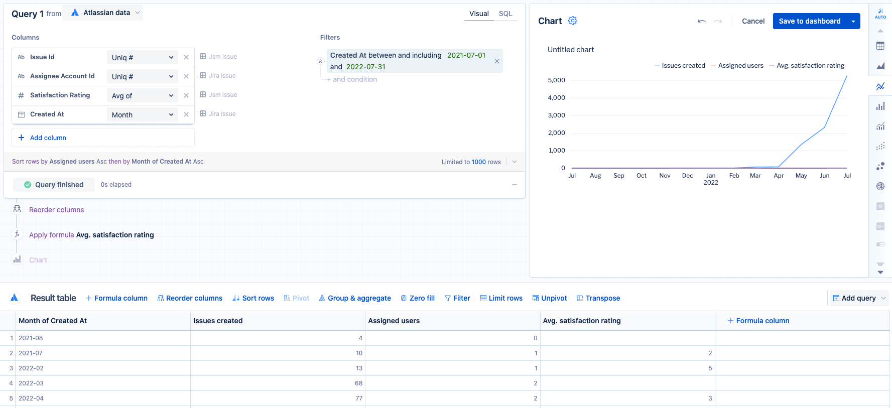
Let’s start by creating a line chart with multiple aggregated columns and one grouped column–this process is the same as usual. In this example, we’ll use our Atlassian Data Lake data source to compare the total number of Jira Service Management issues created, total number of assigned users, and average satisfaction rating.
After adding the necessary columns and adjusting the group/aggregation types in your result table, select Run query then select the line chart from our list of compatible chart types.
The assigned users and average satisfaction rating lines have low numbers compared to the total number of Jira Service Management issues, making it difficult to see the trends in the chart’s current state, so we can use the dual y-axis option to better visualize this data on our chart.
To set up a dual y-axis in your chart:
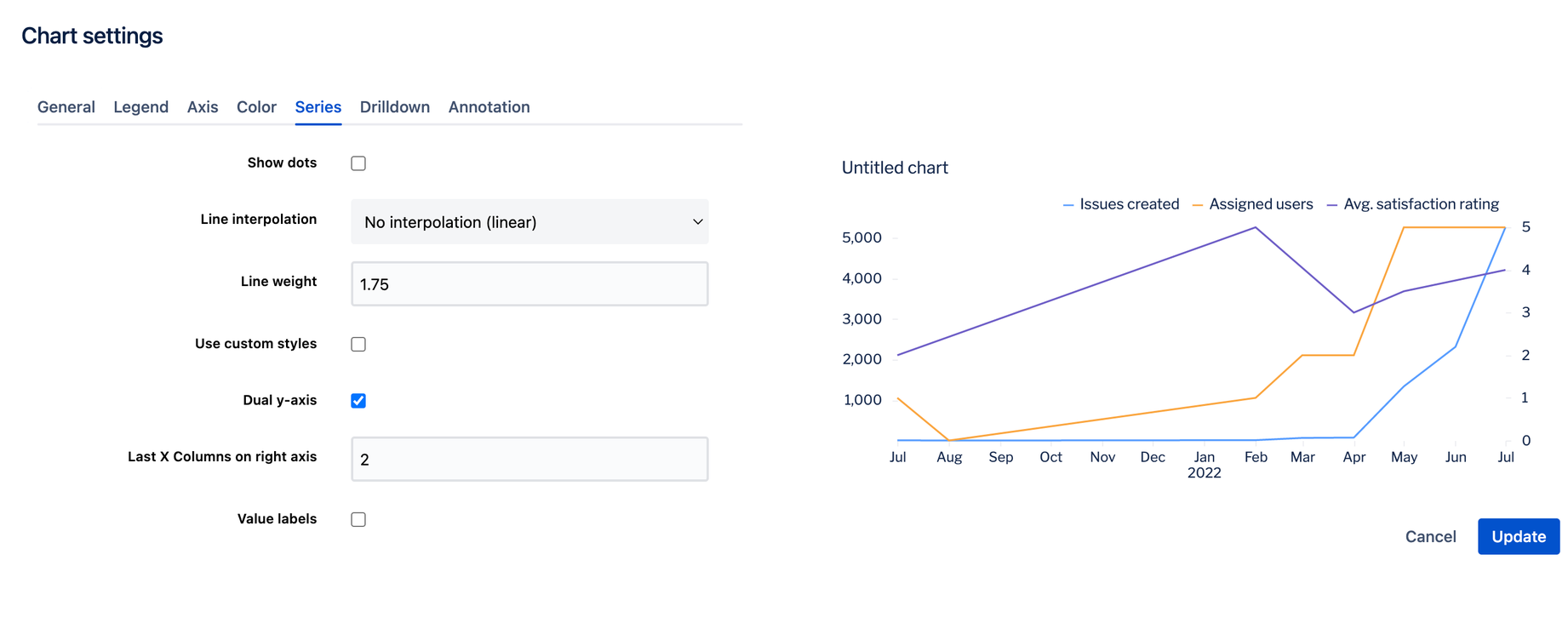
Select the Gear above the chart preview to open the chart settings.
Go to the Series tab.
Select Dual y-axis.
For Last X columns on right axis, specify how many of the last columns to include on the right y-axis. For our example, we want the last two columns included on the right y-axis, so we set this to 2.
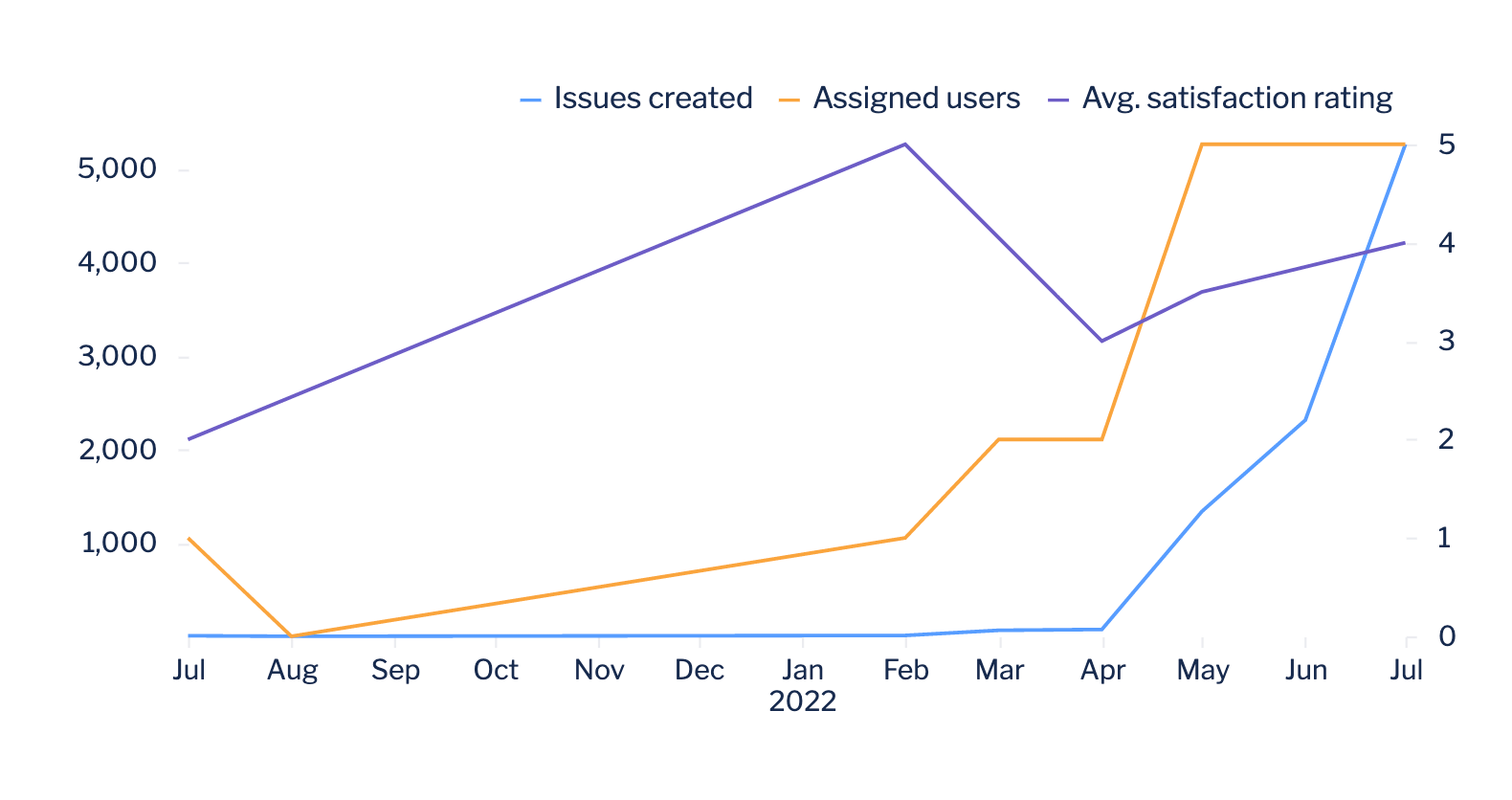
The chart preview in the settings automatically updates to reflect your new settings. Now it’s much easier to see the change in users and satisfaction ratings over time.
If everything looks good, select Update to save your chart settings.
If you want your first column(s) to be on the right axis, rearrange your columns in your query or add a “Reorder columns” step to move these columns all the way to the right (or to a lower position).
Rename your columns or customize your axis labels as needed then save your chart to a dashboard when you’re finished.


