Control Chart

- Issue details: See the cycle time for an issue.
- Time scale: Select a time period to display on the control chart.
- Zoom in: Highlight an area of the chart to focus on a specific time period.
- Refine report: Select the columns and filters you want data for.
Viewing the Control Chart
- Navigate to your desired board.
- Click Reports, then select Control Chart.
- Configure the chart as desired. The screenshot at the top of this page highlights the controls that you can use to configure the Control Chart.
If you're using Internet Explorer 8, the Control Chart won't work.
Printing the Control Chart
To print the report, view the report and use the print functionality for your browser. The report will fit on either A4- or Letter-sized pages in both portrait and landscape modes (note, there is a known issue printing in landscape using Chrome).
Understanding the Control Chart
Before you start using the Control Chart, you should learn how it works. The following questions and answers cover the key functionalities of the Control Chart
The rolling average (blue line on the chart) is issue-based, not time-based. For every issue shown on the chart, the rolling average (at that point in time) is calculated by taking the issue itself, X issues before the issue and X issues after the issue, then averaging their cycle times. 20% of the total issues displayed (always an odd number and a minimum of 5 issues) is used in the calculation.
For example, in the screenshot below, at the point of time where an issue (green dot) is shown, the rolling average is calculated as follows:
- Take the issue plus four issues before and four issues after (nine issues total).
- Average the cycle times for the nine issues.
- Map the blue line to the calculated average.
If the Timeframe is reduced to 'Past two weeks', the number of issues used would reduce, as there are fewer total issues available to use for the calculations.

This method produces a steady rolling average line that shows outliers better (i.e. rolling average doesn't deviate as sharply towards outliers). The rolling average line is also easy to understand, as the inflections are related to the positions of issues.
![]() If you would like to know more about why the rolling average calculation is based on a percentage of the total issues, rather than a time period, see Comparing different methods of calculating the rolling average on the Control Chart.
If you would like to know more about why the rolling average calculation is based on a percentage of the total issues, rather than a time period, see Comparing different methods of calculating the rolling average on the Control Chart.
If the maximum Elapsed Time value on the chart is less than 30 days, then a linear scale is used for the y-axis. If it is 30 days or greater, than a cube-root power scale is used.
When you change the Timeframe, you may include issues with an elapsed time of greater than 30 days when you previously did not, or vice versa. This will change the scale, as described above.
Linear scale for Elapsed Time
Cube-root power scale for Elapsed Time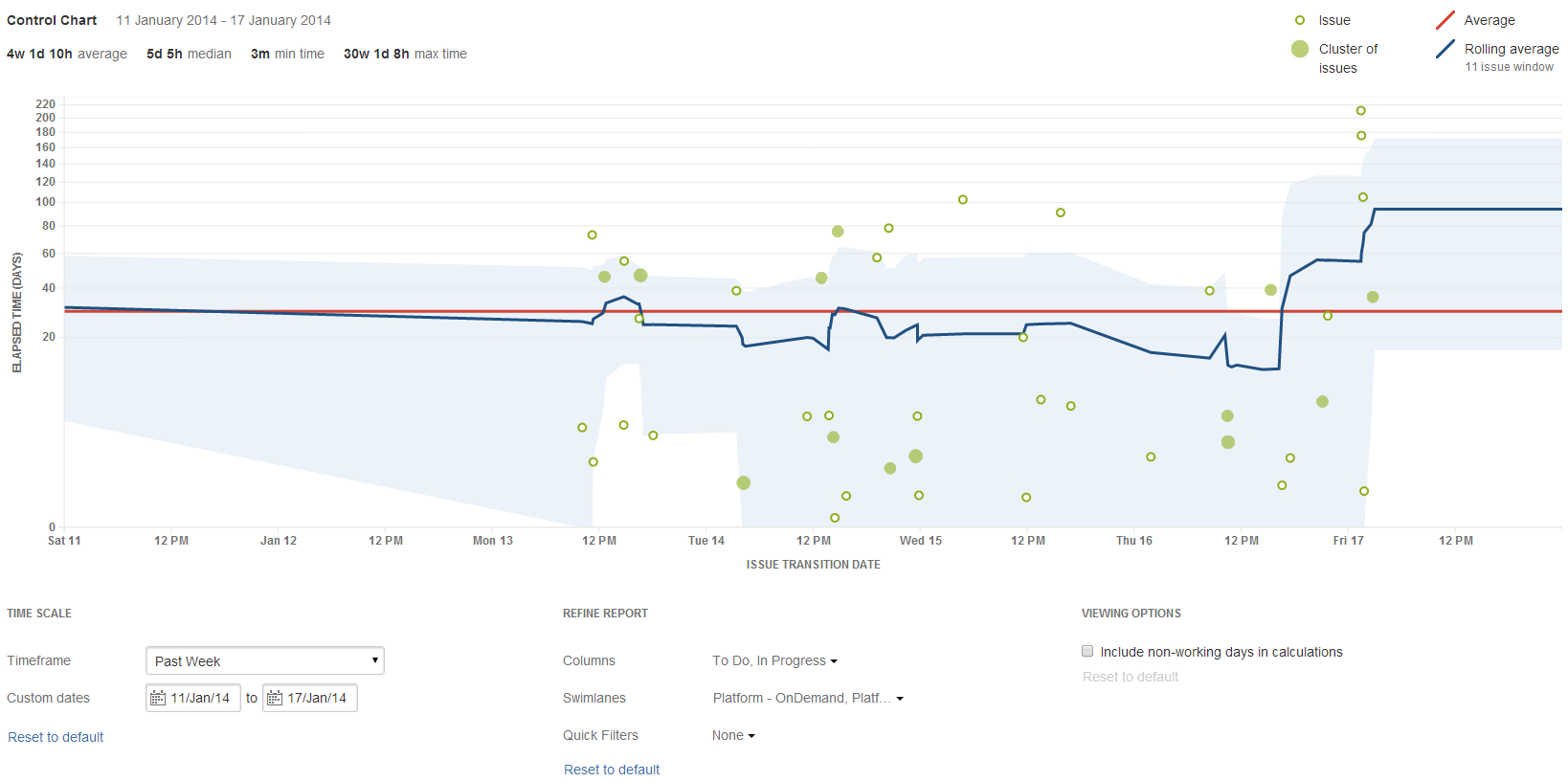
Tips and examples
Learn how to tweak your Control Chart to show the data you need with the following examples:
Tip 1: Remove unwanted outliers
The Control Chart can help you identify outliers. On closer examination, you may determine that certain outliers are invalid due to human error. For example, you may have a story that was started but stopped, then eventually dropped back to the backlog, but not returned to the 'To Do' status. The time that the issue spent 'In Progress' would incorrectly skew the data for your Control Chart.
To remove unwanted outliers from your Control Chart, add a label to each outlier issue (e.g. outlier) and create a Quick Filter with this JQL: labels is EMPTY or labels not in (outlier). Configure your Control Chart to use this Quick Filter.
Example Control Chart with invalid outliers
Example Control Chart with invalid outliers removed (note the smaller scale for 'Elapsed Time')
Tip 2: Remove triage casualties
In a Control Chart, you generally want to track the issues that are resolved as 'Fixed'. Issues that are triaged and resolved as a duplicate, answered, tracked elsewhere, etc can skew the data, bringing the average cycle time down considerably.
To remove triage casualties from your Control Chart, create a Quick Filter with this JQL: resolution in (Fixed). Configure your Control Chart to use this Quick Filter.
Example Control Chart including issues where the resolution is not 'Fixed'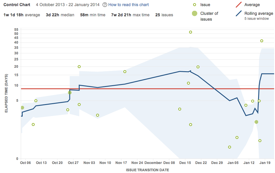
Example Control Chart excluding issues where the resolution is not 'Fixed' (note the higher average cycle time)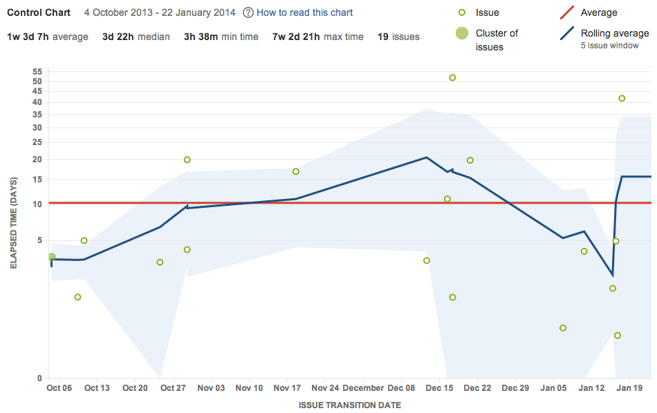
Tip 3: Exclude current work
The Control Chart shows data for issues that have been in a selected column, but are no longer in a selected column. This gives the cycle time (total elapsed time) for the issues. However, by default, this will include issues that are still moving across the board.
To view the data for completed work only in your Control Chart, create a Quick Filter with this JQL: status in (Resolved, Closed). Configure your Control Chart to use this Quick Filter.
Example Control Chart including all issues
Example Control Chart including issues where the status is 'Resolved' or 'Closed' only
Learn how to interpret a Control Chart with the following examples:
Example 1:

- The productivity of the team is increasing: indicated by the downward trend of the rolling average.
- The cycle time of future issues are likely to be close to the rolling average (2 days or less): indicated by the low standard deviation (narrow blue shaded area).
Example 2:

- The team's productivity is pretty consistent: indicated by rolling average being close to the average.
- There are obvious outliers on Tue 14 and Wed 15 (7 days and 10 days elapsed time respectively, compared 2 days on average) that should be investigated.
- Data is becoming more predictable over time.
Known issues
If you encounter an issue that is not on this list, please raise it in our issue tracker.
Next steps
Need help? If you can't find the answer you're looking for in our documentation, we have other resources available to help you. Check out Getting help.
Read the following related topics: