Burnup Chart
The Burnup Chart provides a visual representation of a sprint's completed work compared with its total scope. It offers insights on your project's progress, as well as offers warnings to help you maintain your project's health; you can instantly identify problems such as scope creep or a deviation from the planned project path.
- Click Projects in the navigation bar and select the relevant project
- Click Reports, then select Burnup Chart.
- To choose a different sprint or a different measurement for the vertical axis, click the drop-down menus.
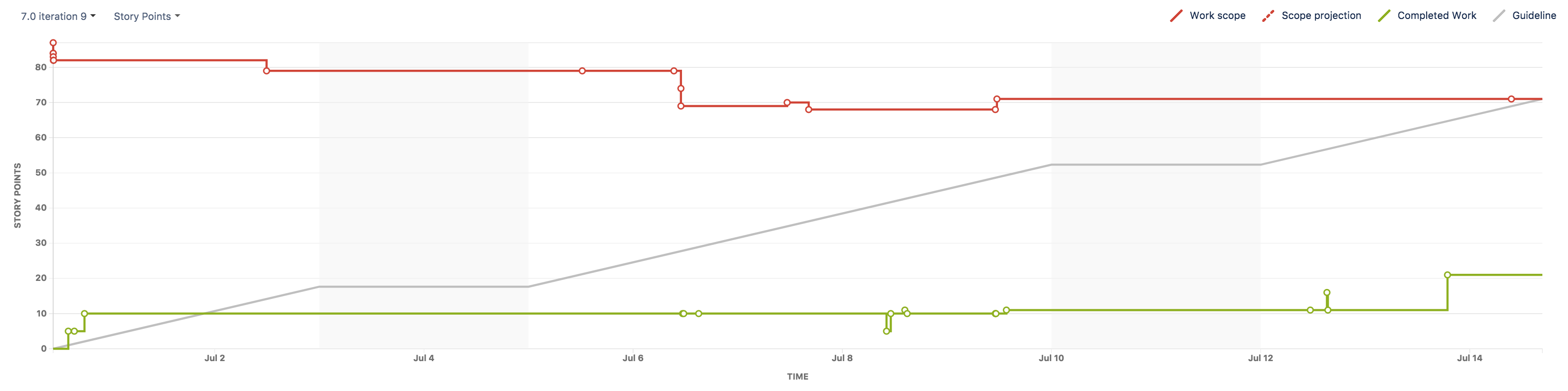
You can view the Burnup Chart for individual sprints in your project, meaning you can see the amount of work completed vs the amount of work remaining on a day-to-day basis.
Before you begin
- The Burnup Chart only applies to Scrum boards
- Story Points on sub-tasks are not included in the Burnup Chart. (Only Story Points on parent tasks are included.)
Understanding the Burnup Chart
- The vertical axis represents the amount of work and can be measured in different ways such as story points, issue count, or estimates. The horizontal axis represents time in days.
- The distance between the lines on the chart is the amount of work remaining. When the project has been completed, the lines will meet.
- Examine the 'Work scope' line to identify any scope creep.
Last modified on Jun 18, 2021
Powered by Confluence and Scroll Viewport.