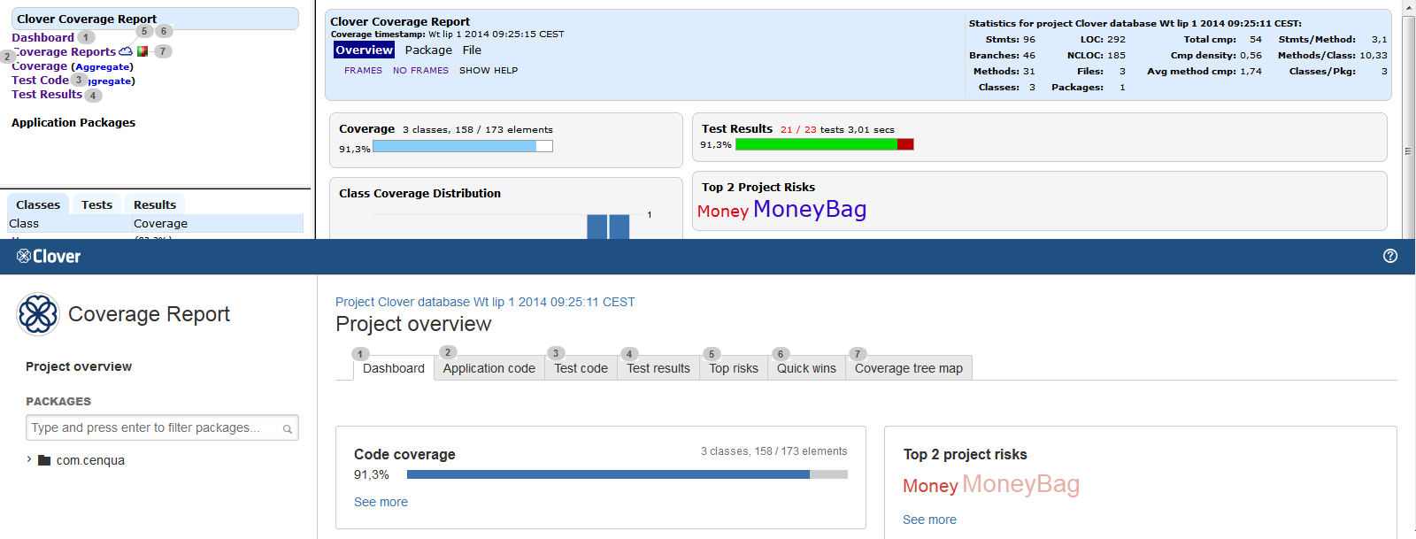
A side-by-side comparison of the Classic and the ADG HTML report
This page shows a side-by-side comparison of Clover's HTML report generated with a "classic" and "adg" style setting.
This page may be helpful for you to quickly learn how to navigate through a new ADG report and how to find information you were used to see in the old "Classic" one.
Project overview
Most of links from the top-left pane have been moved to tabs. Two tabs ("Top risks" and "Quick wins") which were accessible through a cloud icon (5, 6) in the old report are now accessible directly.
Package view
The bottom-left frame with "Classes", "Tests" and "Results" tabs has been removed - instead of this, "Application code", "Test code" and "Test results" tabs are available in the main view (2, 6). A flat list of packages has been replaced by a package tree (1). A "Clouds" link and icon became "Top risks" and "Quick wins" tabs (4).
Source file view
The "Overview Package File" links are replaced by the breadcrumbs (1). List of methods of a certain class as well as list of tests hitting the source file are shown in dialogs, which you can open by clicking "Show methods" and "Select tests ... " links (5,6).
Test results view
Navigation between a test class (source code) and test results (e.g. from unit tests) has been improved - you can simply switch tabs (1, 2). Test results for an entire project are available on the "Project overview" page, under the "Test results" tab (3).


