Viewing work
If you're using the improved planning interface, this page is for you. If you're using live plans, head to Live plans (legacy).
This article provides a high-level introduction to the Roadmap section of a plan. If you're just getting started, this guide will help you understand what you're looking at. We’ll also touch on some of the ways that you can customize how plan data is displayed to best suit you, your team, and your stakeholders.
Roadmap features
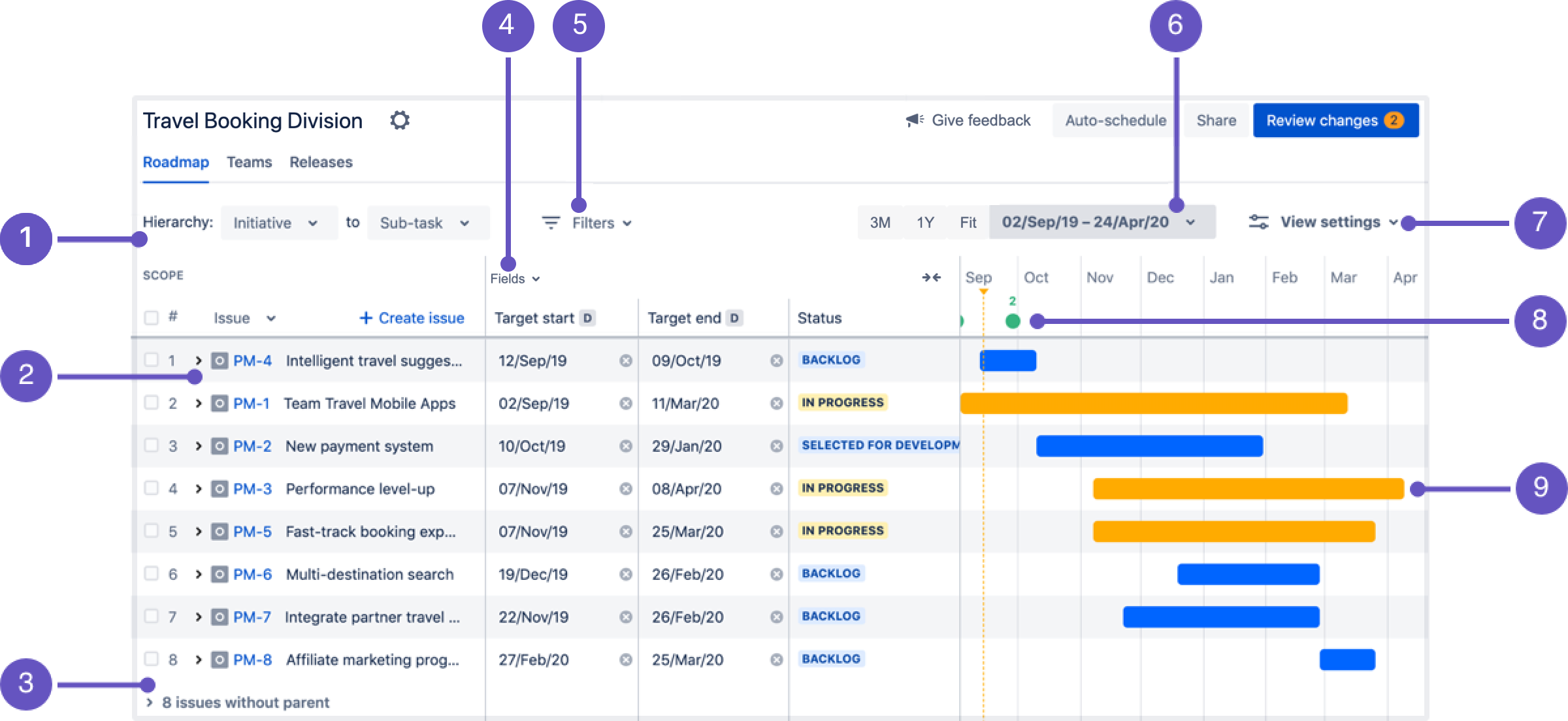
Pictured below is a sample plan. Following that are explanations of the features and sections called out by number.
1) Hierarchy range
Use the Hierarchy dropdown menus to select the highest-to-lowest hierarchy level that you want to view issues for. For example, Initiative to Sub-task, or Epic to Story.
Learn more about configuring hierarchy levels
2) Issues: expand and collapse
When there’s an arrow (>) in front of an issue it indicates that there are child issues. Click the arrow to expand the collapsed rows and and view the child issues.
You can also click the Issue dropdown menu to expand or collapse all issue hierarchies in the plan:
If you select Expand all and the hierarchy levels are set from initiative to story, as pictured above, you’ll only see issues within that range. To see issues from a higher or lower level, change the Hierarchy setting.
3) Issues without parents
Sometimes a plan can include issues not connected to a parent issue (for example, a story that doesn’t belong to an epic). These issues are grouped in the scope section under "x issues without parent".
To view these issues, click the arrow (>) to expand the collapsed rows.
4) Fields
The columns in the fields section display issue details accessed from Jira. This includes sprints, assignees, releases, dependencies, priorities, and more.
By default, newly created plans include columns for target start, target end, and status. However, you can customize these fields to ensure that your plan’s data is always relevant and contains the right amount of detail for your audience.
Using the Fields menu, you can add or remove issue details as fields in your plan. You can also drag and drop the fields to change the order they’re displayed in. If you’ve used any custom fields, these will be clearly marked as ‘custom’ in the menu.
Learn more about displaying issue details
5) Filters
Use the Filters menu to display issues relevant to what you’re focused on. For example, you can filter by project or team to forecast upcoming work, or filter by assignees to delegate work. You can also filter by issue details, issue types, dependencies, and more.
Learn more about filtering issues
6) Timeframe settings
The timeline, far right, is the visual indicator of your roadmap. Above the timeline are settings for the timeframe to display:
- 3M — Updates the timeline to show the next 3 months, starting from the current day.
- 1Y — Updates the timeline to show the next year, starting from the current day.
- Fit — Adjusts the timeframe of the timeline to fit the start and end of all schedule bars into view.
- Custom — Provides two options to choose from:
- Fixed — Set a specific start and end date to view that time range on the timeline.
- Relative — Select a period of time that is relative to the current date. For example, show the past 2 weeks and the next 3 months. The timeline view will update daily based on the time range specified.
The colored bars pictured in the sample plan up top are schedule bars. If you don’t see any in your plan, it’s because there are no dates set for your issues yet.
7) View settings
Use View settings to customize how issues and related information is displayed, categorized and colored in the roadmap view of your plan. For example, you can group issues by swimlanes and choose to have them grouped by project, team or sprint. You can also choose the sort order for issues in the plan, show or hide issue warnings, and more.
Learn more about customizing view settings
8) Release details
There’s a Releases section in your plan that we won’t explore here, however it’s useful to know that release progress can be tracked from the timeline, and release details are easily accessible, too.
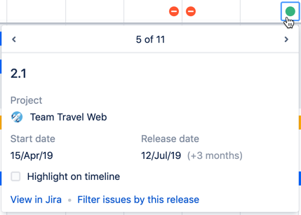
The green and red icons displayed on the timeline indicate when a release is on or off track. Click an icon to see more information about the release:
Learn more about monitoring releases
9) Schedule bars
“Schedule bars” are the colored bars on the timeline associated with issues that have dates. If there is no start or end date scheduled for an issue, you can click in the timeline section of the issue’s row to add a schedule bar:
If you see a schedule bar that has solid color at one end, with color fading at the other end, it’s because the issue has only one target date set; either the start or end date, but not both.


